
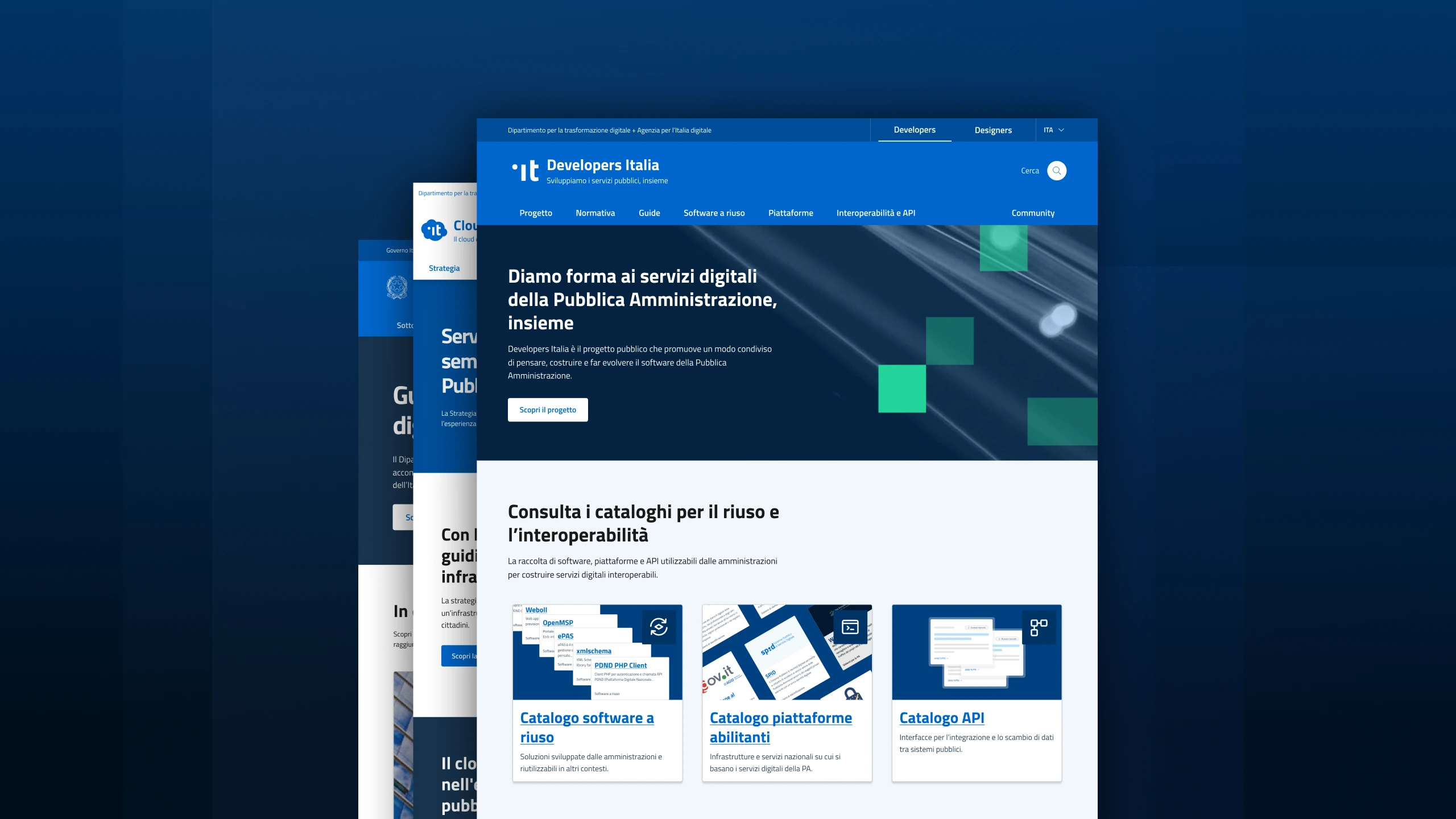
The project involved different areas of expertise in rethinking three distinct digital experiences, while establishing a shared foundation for how they could evolve within the DTD ecosystem.
Introduction
The Department for Digital Transformation brings together a wide
range of digital initiatives, each with its own goals, content
and organisational context.
Working within this ecosystem meant understanding the needs of
the people and teams behind each product, while considering how
information was structured, how users moved through the
experiences and how the different products could evolve over
time.
Project Output
The project resulted in three redesigned digital experiences,
each with a new UX structure, clearer content and a visual
language tailored to its specific needs.
Alongside the individual redesigns, we established a shared
foundation for the ecosystem: reusable page structures, modules
and design patterns that could be adapted across different
contexts. This allowed the three products to evolve from a
common set of principles without forcing them into the same
experience.
My role
As a UX Designer, I was involved in the initial stakeholder
interviews as part of the project team, helping gather and
structure insights across the three products.
I worked on the UX definition, focusing on the information
architecture, navigation and content structures, in close
collaboration with UX Writing.
Alongside the UX work, I designed the pages themselves and
developed a new layer of reusable modules based on the
foundations of the Design System .Italia.
The first step was to get closer to the people behind each product, understanding their goals, needs and the challenges they faced with the existing experiences.
Learning from stakeholders
We started by engaging with stakeholders across the different
products. Through interviews and discussions, we explored the
goals, priorities and challenges behind each website, as well as
the needs of the people they served.
We used these insights to frame the main design challenges and
establish the foundations for the next phase of the work.
What emerged from the research was a clearer picture of how different people approached the products, and how the information needed to be structured around those needs.
Defining the architecture
I translated the research insights into the information
architecture of the three experiences, defining how content
should be organised, connected and accessed.
The audiences approached the ecosystem from different
perspectives: public administration teams looking for practical
information and services, technical partners seeking more
specific resources, and citizens interested in understanding the
DTD’s initiatives and activities.
This was a collaborative process closely connected to UX
writing. While I worked on the structure, hierarchy and
navigation, we mapped concepts and content together, aligning
how information was organised with how it needed to be
understood.
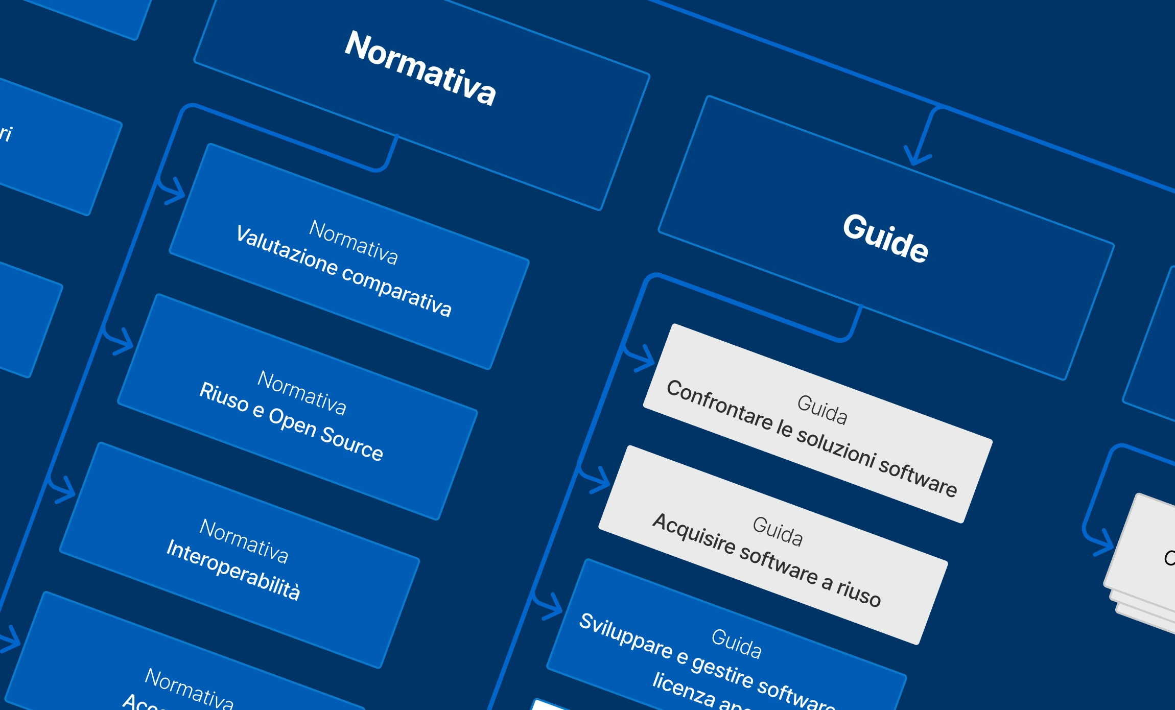
The structures emerging from the content mapping became the basis for a modular approach, allowing us to define reusable building blocks and combine them into the final page designs.
From atoms to building blocks
The
Design Stystem.Italia
provided the atomic elements and visual foundations for the
interfaces.
Starting from the content and information mapped during the UX
phase, I identified recurring ways of presenting and interacting
with different types of information. Then, I translated these
patterns into larger, reusable modules.
This introduced a new level of granularity between the atomic
elements of the Design System and complete page structures,
creating reusable building blocks that could support future page
creation. Editors could combine them independently within
defined structures and patterns, adapting them to different
needs from static pages to more editorial experiences.
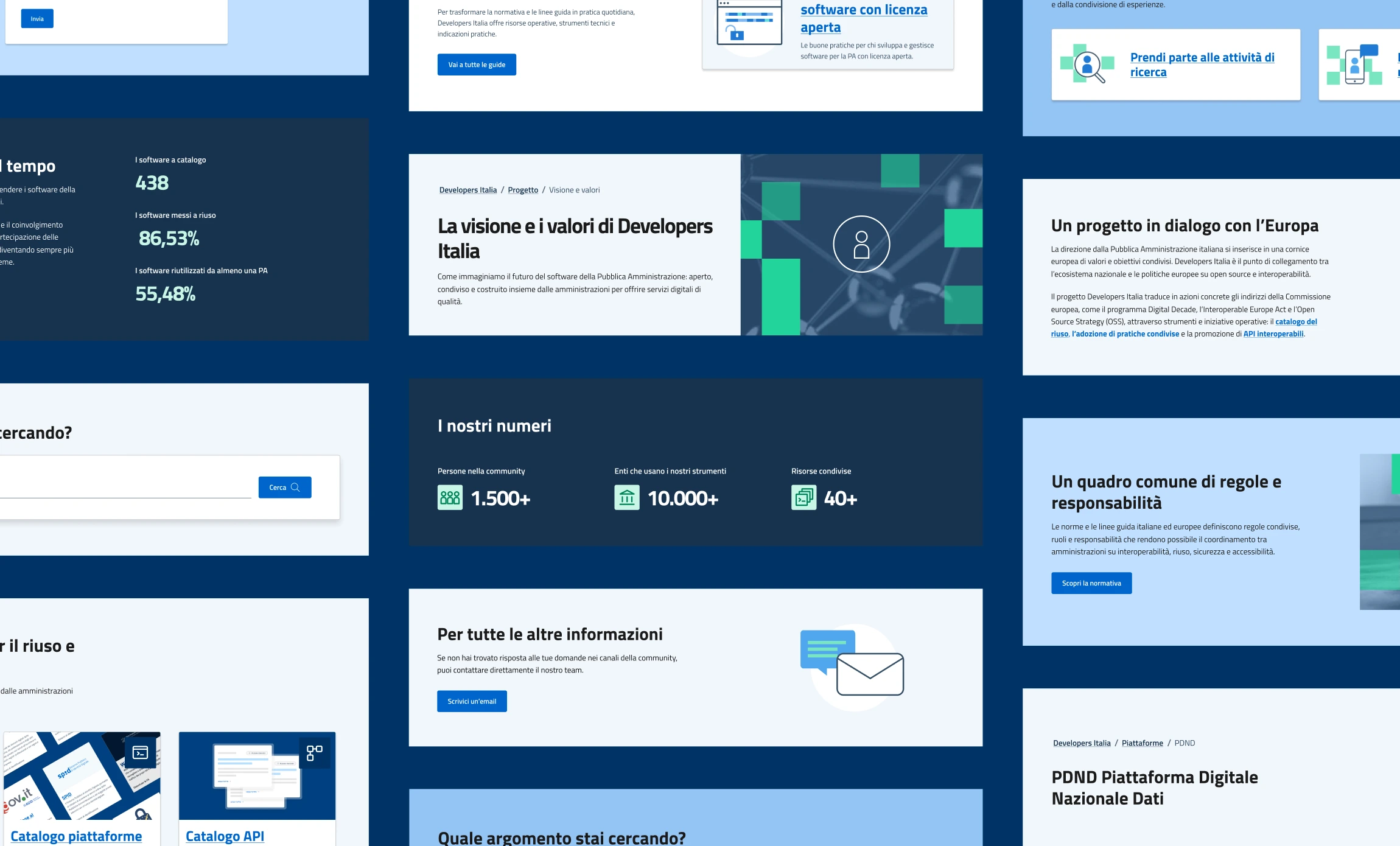
Designing the pages
With the structures in place, we brought them into the actual
experiences.
I designed the pages for the websites, working closely with UX
Writing and Visual Design to bring together content, interaction
and a distinctive visual identity for each product. Each page
was designed according to the accessibility criteria and
guidelines of the Design System .Italia, ensuring that the
interfaces remained consistent and usable across different
devices and needs.
Working with real content and different page types also allowed
us to refine the structures and validate how they worked across
the three experiences.
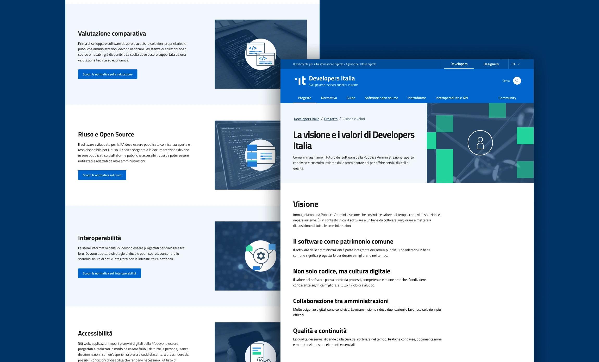
As the structures moved into the final interfaces, the work became increasingly interconnected, with different areas of expertise contributing to the realisation of the project.
Designing together
From understanding the content and its audiences to defining the
information architecture and designing the interfaces, the
project connected structural thinking with the details of the
final experience.
Working on a project of this scale also meant coordinating
across an extended team, where different areas of expertise had
to progress in parallel. UX Writing, UI Design, Service Design
and Development were closely connected to the UX work, with
decisions in one area often affecting the others.
Keeping these different strands aligned throughout the process
was an essential part of turning the initial structure into a
coherent and flexible experience.