The data visualization aims to inform and raise awareness in users about data breaches, showing the magnitude of the phenomenon and its trend over time.
Introduction
The purpose of the project was to create an interactive data vis in Tableau starting from a data set of our choice. Once created, the visualization had to be evaluated with the target users in order to find problems during the interaction and fix them.
Project output
Starting from these premises, I designed and developed a desktop
dashboard made up of multiple graphs arranged on a vertical
page.
The data vis represents a list of data breaches,
using data coming from various sources, that involve the number
of stolen records, the methods employed, the locations and type
of the organizations that were affected by the breaches, in a
time period that spans from 2004 to 2021.
The interactive version of the dashboard is available
here.
In the first phase of the project I focused on exploring the dataset and making some adjustments on it, in order to have a complete set of data breaches ready to be analyzed in Tableau.
Dataset description
The dataset that I used was available on
Kaggle, however the original source of data came from Wikipedia. This
dataset contained all the main data breaches that have occurred
in the world from 2004 until 2021. The dataset had 293 rows,
which is the number of entries of the reported data breaches.
From the Wikipedia article, it has been reported that the data
was collected from various sources, including press reports,
government press releases and news articles. The list consisted
of all data breaches that resulted in theft of 30,000 or more
records, even though many minor breaches still occur
continuously.
The dataset contained 5 variables:
-
Entity.
The name of the company, organization or institution that has undergone an attack -
Year.
The year in which the data breach occurred -
Records.
The number of records that have been stolen -
Type of organization.
The field to which the attacked organizations belong to -
Method.
The cause that led to the data breach
Data processing
The dataset from Kaggle did not contain any missing data.
However, I made some adjustments to the type of organization
variable. Originally, the number of categories contained in the
column was 54, but they were often very similar to each other.
In addition to this, some organization types were reported with
semantic errors. At the end of this process, the number of
categories was reduced to 19.
Then, I decided to add another variable to the dataset in order
to better understand the geographical impact of the phenomenon.
So, I added the “State of entity” column, which contains the
countries where the attacked organizations have their registered
offices.
Then, I focused on the definition of target users and on the visual exploration of the phenomenon in Tableau in order to design the most relevant graphs for users.
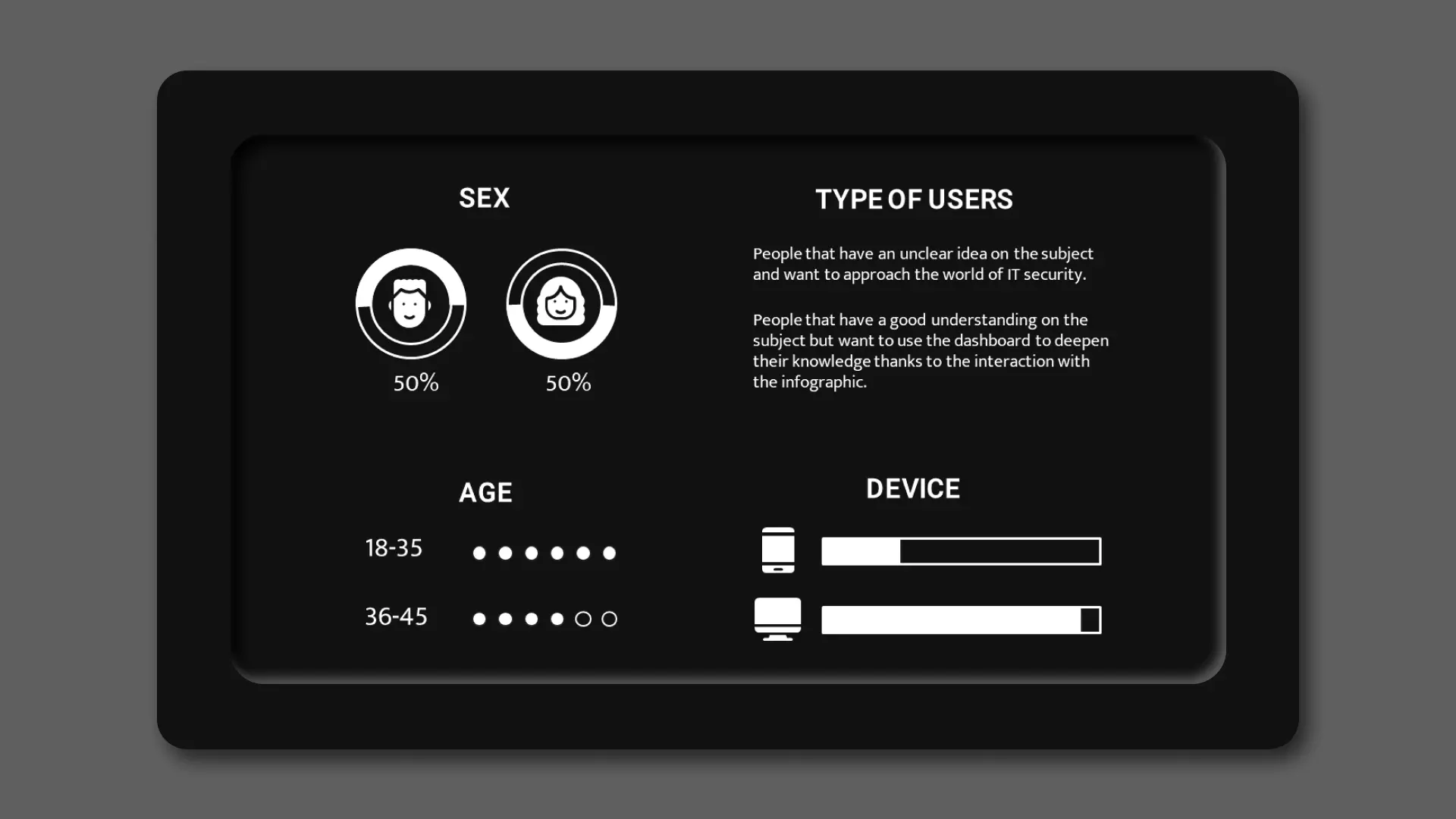
Target users
My visualization aims at different types of users: from those
who have an unclear idea on the subject and want to approach the
world of IT security, up to those who have a good understanding
on the subject but want to use the dashboard to deepen their
knowledge thanks to the interaction with the infographic. In
general, I address to young people who frequently uses digital
devices, without being fully aware of the risks.
Furthermore, given the structure and interactivity of the
dashboard, it can only be used on a computer's desktop, so I
expect that the target users are already familiar with it.
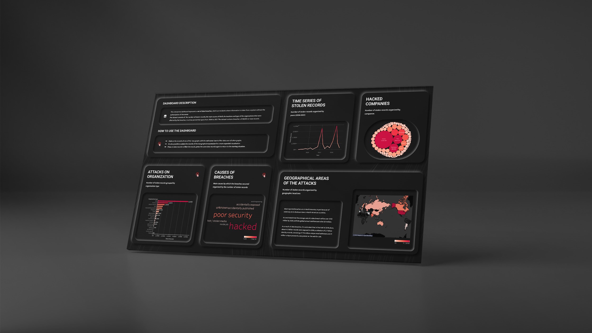
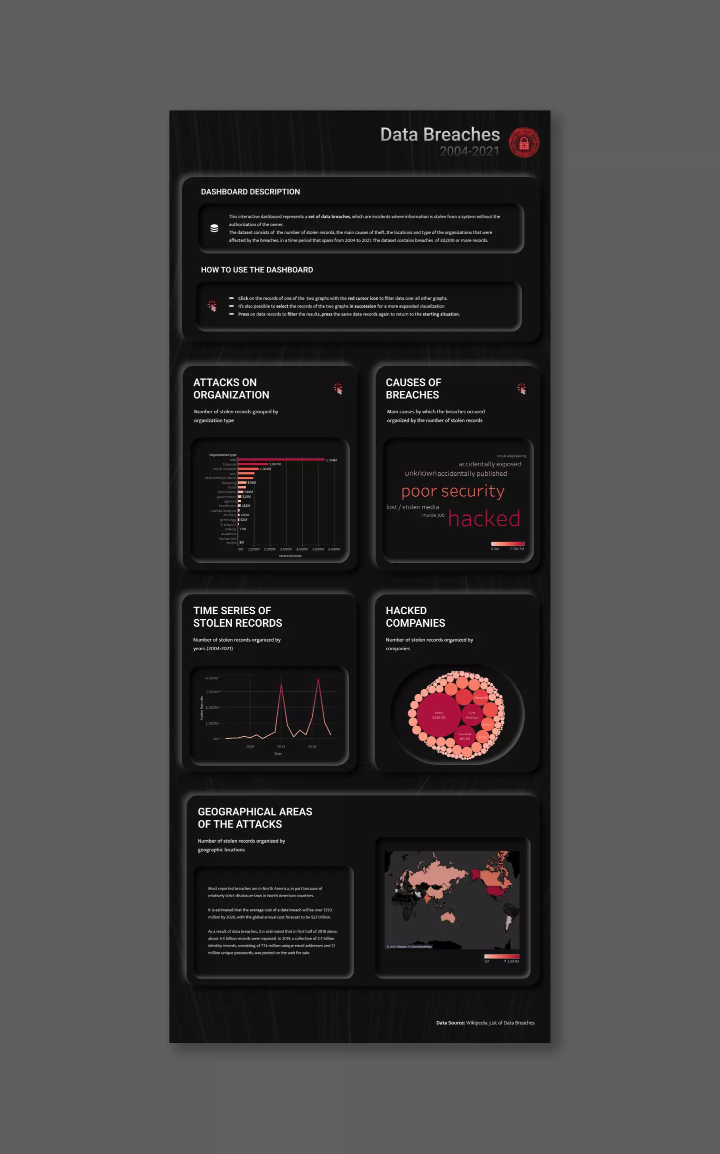
Graphs architecture
Starting from the updated dataset, I created in Tableau the most relevant graphs to communicate the phenomenon, trying to give a complete overview through different types of representation. In particular, I designed:
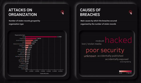
-
A bar chart.
I decided to show the total amount of data stolen in the different organization types as the first visualization.
The bar graph allowed me to clearly show the quantitative differences between organizations and the absolute number of stolen records organized in descending order. -
A word cloud chart.
The second visualization was related to the methodologies used to carry out data breaches.
I have decided to use a word cloud, in which the amount of stolen data is expressed hierarchically both by the size of the word indicating the causes of breaches and by the color value assumed by the word.
Since it has a limited number of methods, this view is the most effective from an informative and perceptive point of view. -
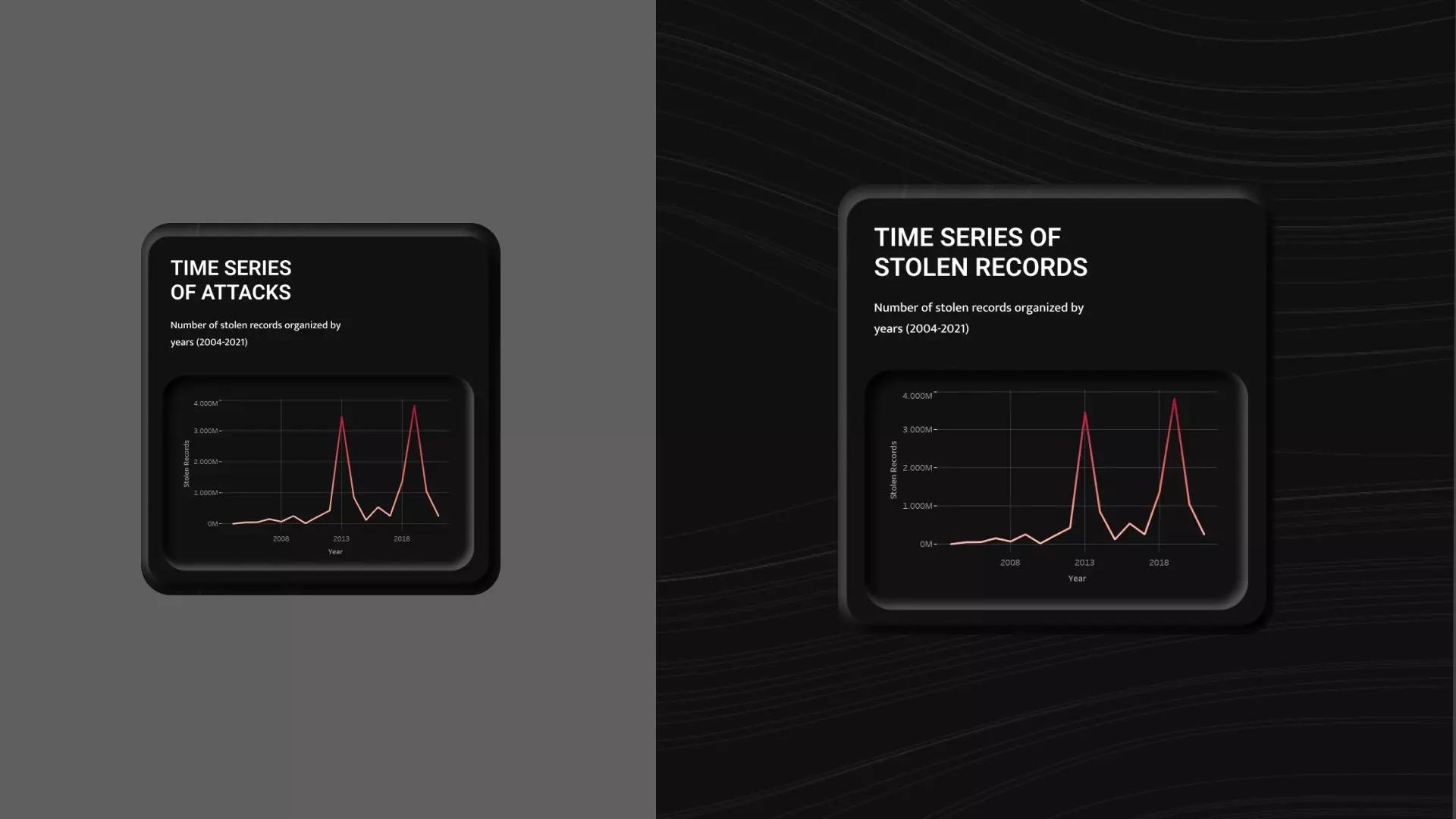
A line chart.
The third visualization shows the amount of data stolen during the time period that ranges from 2004 to 2021.
Since the time of the dataset is expressed in a discrete way, I have opted for the use of a line graph, which allows me to clearly show the trend of the phenomenon over the years. -
A bubble chart.
The fourth view shows the number of data stolen from various companies in the dataset.
This graph seems relevant to me because it allows users to recognize the names of well-known international companies to which they are used to entrust their data. The use of a bubble chart allows on one hand to quickly visualize the most affected companies and on the other, to outline the extent to which companies were involved in the attacks. -
A map chart.
The main purpose of this view is to highlight the territorial distribution of the attacks in a impactful and clear way.
In this case the amount of stolen data is expressed by the color value of the state, in relation to the legend on the bottom right of the graph.
Once the graphs and the target had been defined, I focused on the visual tone and organization of the dashboard.
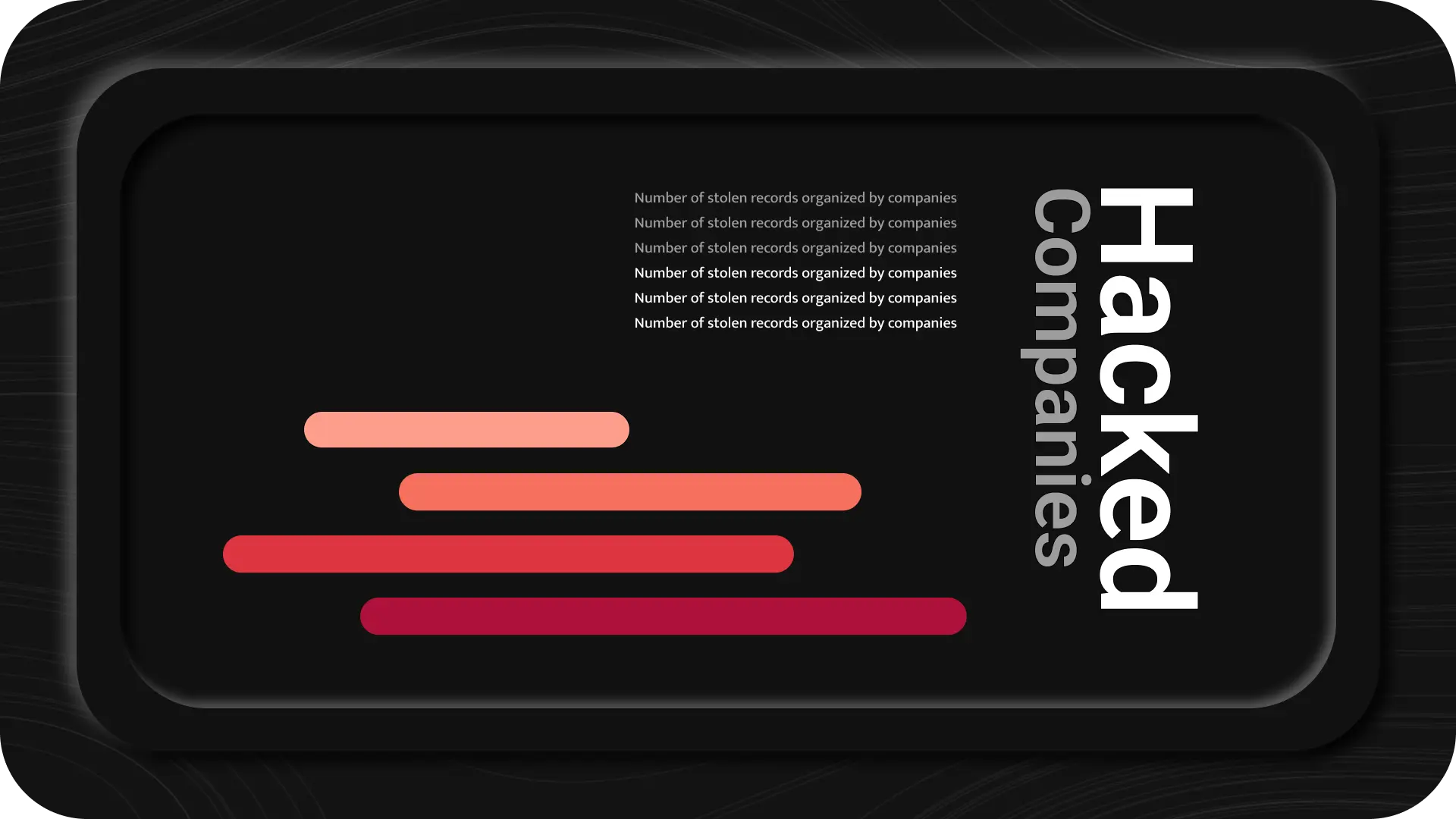
Organization
The dashboard layout was created in Figma and added in Tableau.
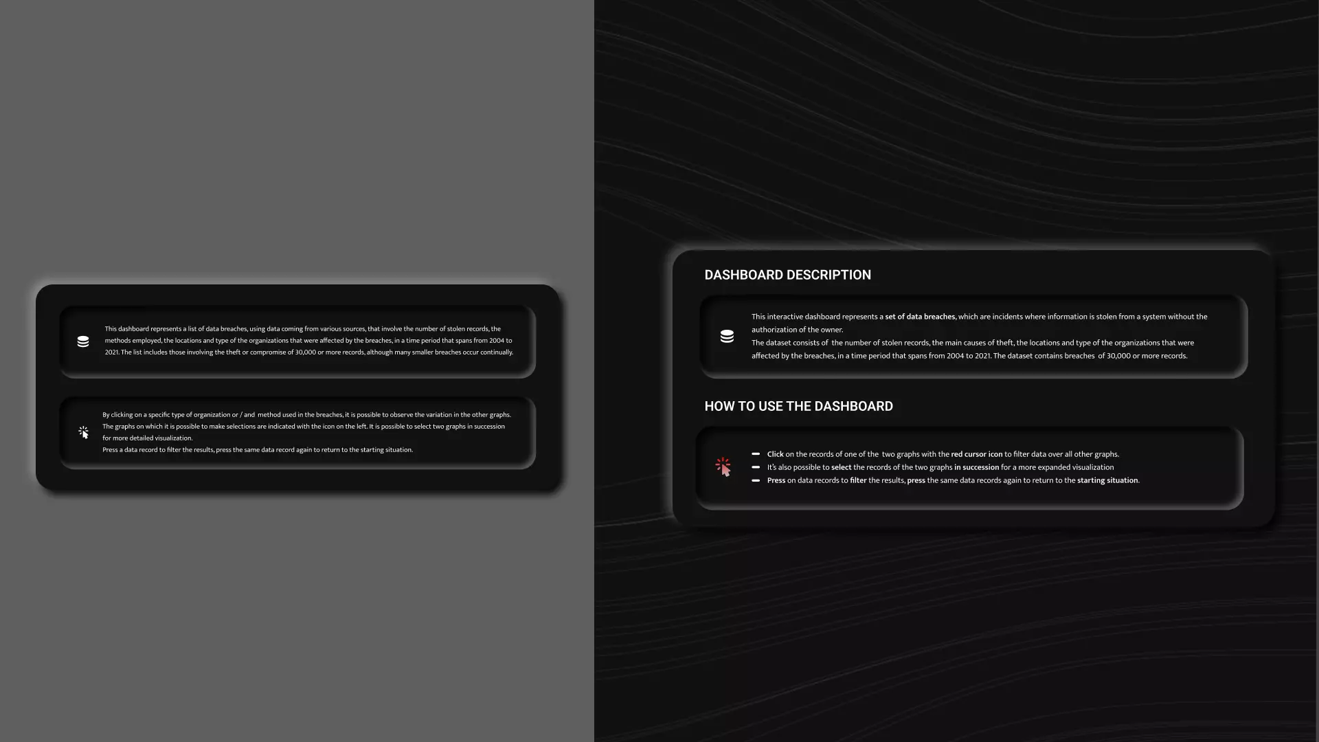
At the top of the dashboard I provided some information to the
visualization to allow users to better understand the structure
and the interactive use of the page.
In particular, the first paragraph provides users with
information about the content of the data visualization, in
order to introduce them to the topic. The second paragraph
contains the instructions to the users on how to discover the
interactive nature of the dashboard.
Different graphs have been created below the introductory part.
Each graph comes with a title and a description, which clarify
the meaning of the visualization. The sections containing the
interactive graphs come with a graphic symbol which allows the
graphs to be recognized rather than remembered.
The division of the dashboard into sections has been designed to
clearly distinguish each view from the others.
Visual choices
For my project, I used a dark neuromorphic design. It maintains
a clean and modern visual communication and it ensures good
internal coherence between graph sections.
The decision to use red monochromatic scales, representing
quantitative data, on a dark background, has allowed me to
obtain an impactful overview of the graphs, which seeks to evoke
the seriousness of the topic while still being easy to read.
For the texts, I used the Roboto typeface family for the titles
and Mukta for the paragraphs. I chose Roboto for its mechanical
skeleton and its geometric forms and Mukta for its contemporary
style.
Interactivity
The dashboard guarantees some interactivity to the users. In
fact, it is possible to perform some filtering operations on two
specific graphs of the visualization and observe the changes in
all the other graphs at the same time. Moreover, I have provided
not only for the possibility to interact with a single graph,
but also for the possibility to select elements of the two
graphs in succession to perform two consecutive filtering
operations and to obtain a more detailed selection.
I have chosen two graphs to be interactive: one related to
attacks on organizations and the other related to the hacking
methods used. Both have been chosen because they allow the user
to clearly view and select directly from the graph all the
categories present in the dataset for that specific section. In
addition to this, they are both data-rich visualizations on
which it makes sense to perform filtering operations to carry
out more specific analyses.
After the design part, I performed some evaluations of the dashboard with target users to understand how pleasant and usable it was.
User testing
In this phase, I observed 5 users perform three specific tasks
that required them to interact with the views, in order to
detect the biggest errors committed.
The tested users were between 18 and 35 years of age and they
had average digital skills. Four out of six users were already
familiar with the topic of the dashboard. For each task I
observed the execution time on the visualization, the effective
achievement of the tasks, the number and the type of committed
mistakes. The three tasks to be performed were:
-
Task 1. Observe the dashboard and indicate which is the
most used hacking method, then indicate the country in which
most records were stolen.
The goal of the first task was related to verifying the ease of reading and comprehension of the dashboard.
-
Task 2. Select a hacking method of your choice and tell
me the names of the first three companies to which most
records were stolen. After that, return to the initial state.
The goal of the second task was related to verifying the effectiveness of the single filtering method and the comprehension of the filtered information. -
Task 3. Comment on what happened over the years to the
organizations of financial type hacked due to poor security.
The goal of the third task was related to verifying the effectiveness of the double filtering method and the comprehension of the filtered information.
Error analysis
The user testing revealed some issues mainly in the
accomplishment of the first task, in which the user had to
become familiar with the Tableau environment and with the
dashboard. This is highlighted also by the execution times,
which were longer for the first task, even though it was the
easiest one. Once the users understood the general functioning
of the dashboard, on average they accomplished the next tasks
without any problems.
Here I display the errors made by the users and their
frequencies, with the aim to propose some revisions to the
dashboard for the most important mistakes:
-
Task 1.
3/6 users did not correctly identify the most used hacking type (which was "hacked"). One user stated that he did not indicate “hacked” as an attack method because he thought it was an umbrella term for other words, rather than a methodology.
1/6 users users did not figure out from the introduction the meaning of a "data breach", because he was not familiar with the topic. -
Task 3.
3/6 users did not immediately comprehend the graphs which could filter the information. In fact, he attempted to click also on the graphs that did not allow it.
2/6 users did not correctly interpret the information of the line chart. In fact, they said that the graph showed the number of attacks over the years, rather than the number of stolen records over the years.
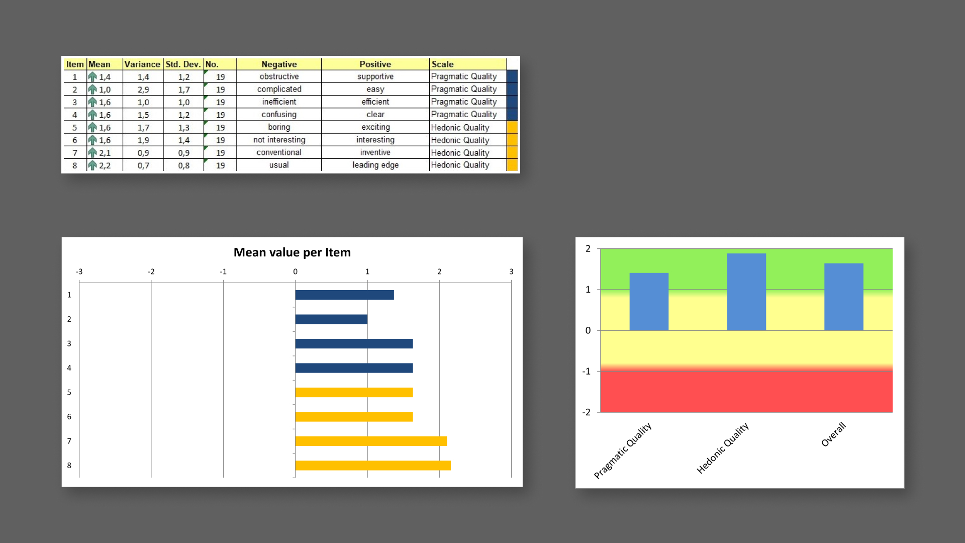
Psychometric questionnaire
During the evaluation phase I sent the short version of the User
Experience Questionnaire (UEQ) to a sample of 19 users to
statistically evaluate some aspects of the dashboard.
The scales of the questionnaire cover a comprehensive impression
of user behavior. Both classical usability aspects (efficiency,
perspicuity, dependability) and user experience aspects
(originality, stimulation) are measured.
The questionnaire was sent to a sample of 19 users via Google
Forms. They filled it in without supervision. The sample users
were between the ages of 20 and 35, with average digital skills
and with a middle-high level of education.
Questionnaire results
From the questionnaire results, I noticed that in general the
dashboard achieved positive results, with some differences
between pragmatic quality and hedonic quality.
In
the results table, mean values between -0.8 and 0.8 represent a
neutral evaluation of the corresponding scale, values > 0.8
represent a positive evaluation and values < -0.8 represent a
negative evaluation. The range of the scales is between -3
(horribly bad) and +3 (extremely good). But in real
applications, only values in a restricted range will be
observed.
As shown in the table and in the graphs below, in my case it is
possible to observe higher values for hedonic quality items than
for pragmatic quality ones. In particular, the sample users
assigned higher grades for the inventiveness and the original
style of the dashboard. It is possible to notice slightly lower
grades, but still positive ones, to the ease of use of the
dashboard in the pragmatic quality entry.
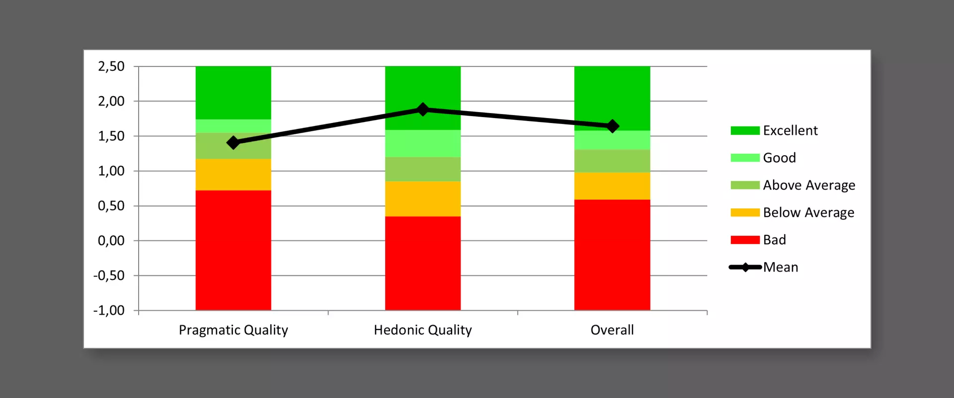
Then I compared the results for the evaluated product with the
data related to benchmark categories. The measured scale means
are set in relation to existing values from a benchmark data
set. The data set that I have used contains data from 21175
persons from 468 studies concerning different products.
The graph below shows that the dashboard obtained results all
above the average and it confirms that the hedonic quality is
the scale that obtained the best results. In particular, the
visualization is in the 10% of the best results obtained in the
evaluation of the products referred to the benchmark dataset.
In the last part of the project I redesigned some aspects of the dashboard based on the errors made by the users.
Redesign
The first issue regarded the introductory part.
A user, who was not familiar with the topic, had some
difficulties in understanding the meaning of the term "data
breach". So, I decided to add some more context to better
explain the phenomenon to less experienced users.
Moreover, the part explaining the functioning of the dashboard
was hard to understand to some users. So I modified it, trying
to highlight the most important steps in the interaction and by
revising the text in the form of a bulleted list so that it
would be easier to read.
The second correction I made regards the header of the graph
showing the methods used to carry out the hacking attacks.
Several users were confused by the caption "methods", given the
case that they actually were the causes which provoked the
attacks. Therefore, I modified the title and the header of the
graph to clarify the aim of the graph.

A similar situation occurred in the title of the line graph: it
resulted in misleading users to understand the purpose of this
graph. Several users erroneously thought that the timeline
referred to the number of hacking attacks.
Therefore, I modified the title to clarify that the graph
actually indicates the number of records stolen over the years,
not the number of attacks.