At the beginning of 2021, I analyzed the existing Italian ecosystem related to the management of Covid documents needed to travel in Europe, in order to identify problems and propose solutions.
Major problems
During 2021, the Covid emergency in Europe had a significant
impact on travel, with measures that tended to change frequently
and had differences depending on the epidemiological situation
of a country over a given period of time. These changes made the
organization of a trip within the European borders more
difficult and uncertain.
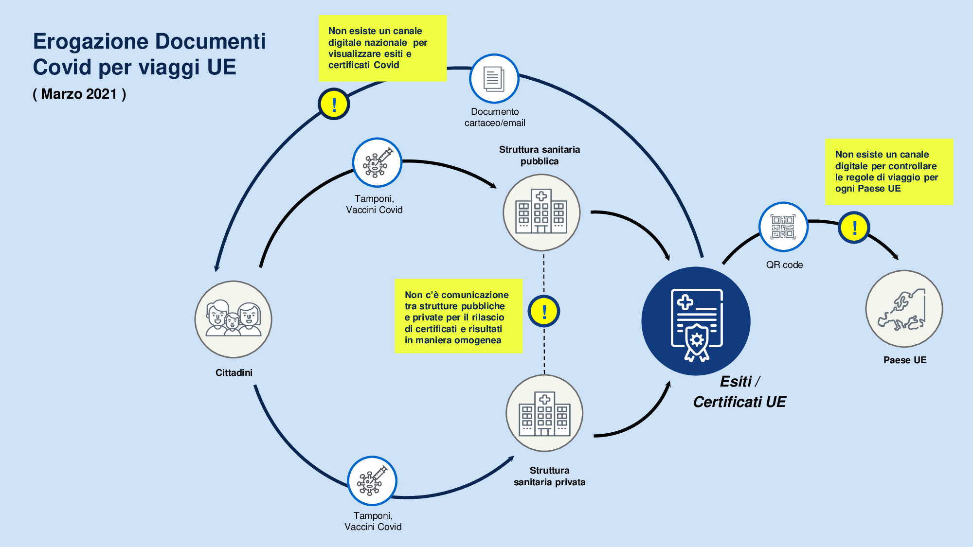
In the first months of
2021, there was no centralized digital channel for Italian
citizens to visualize their Covid documents such as vaccination
certificate or swab results. However, they were fundamental both
for evaluating possible infections and for going outside
national borders. Each health facility, private or public,
managed independently the release of these documents, with
different communication channels, times and methodologies.
Moreover, at the time, it was very complex to visualize the
Covid rules currently in force for entry into a specific
European country, discouraging departures.
Project output
Starting from the problems and evaluating different solutions, I
designed Travel Safely, a state mobile application that could
allow all Italians citizens to access the results of tampons,
Covid vaccines and Covid certificates necessary to move freely
within the European Union through a verification structure at
community level.
Travel Safely has also been conceived as a support for Italian
citizens to consult more easily the regulations in case of
infection and travel restrictions related to the entry in a
specific EU country.
During the process, I focused on the users, trying to identify what type of Italian citizen would travel in the first few months of newly opened European routes and what were their needs.
Travel statistics
First, I looked at pre-pandemic travel statistics for Italian
citizens to better understand the trends of Italian travel and
to narrow the field of research.
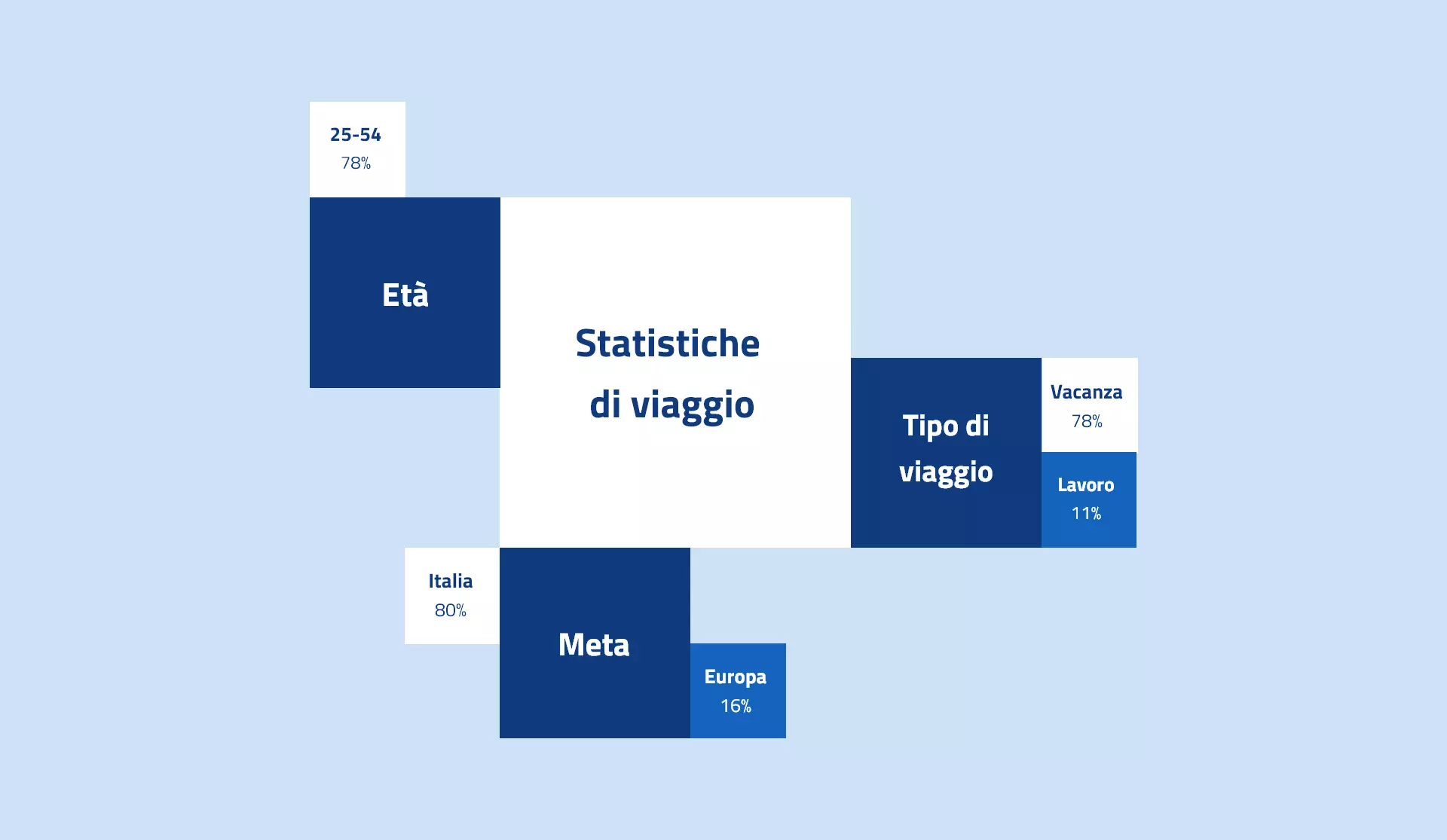
From Istat data, in 2018, out of 78 million trips, those for
vacation reasons were 89% out of the total and those for
business reasons 11%. Most of the trips had as their main
destination domestic locations, but 20% of travelers were
directed to EU countries.
In terms of age, the largest segment of the population that
travelled for work or leisure during that year was between 25
and 54 years of age.
Then, I decided to supplement these statistics with some
projections about travel behaviors in the near future. In
particular, booking.com had made some estimates for the future
based on researches conducted on over 20,000 travelers in 28
countries, including Italy.
First of all, it was highlighted that remote work has changed
the way travel is perceived: more than a third of the travelers
surveyed had already thought about booking accommodation to work
in a place other than their residence. The analysis also
included some thoughts on technology and its role in redefining
the world of travels: 64% of travelers surveyed thought it would
be important to prevent health risks while travelling.
Potential users
With all this data, it was possible to identify certain types of
Italian users who would have travelled in the immediate future.
In particular young people ( high school and university students
) who would have resumed traveling for tourism purposes after
the long period of restrictions, workers who would benefit from
smart working and would choose the destination in which to
settle to work and households with adult members between the
ages of 25 and 54.
Semi-structured interviews and needfinding
Based on these premises, I interviewed some Italians who met the characteristics identified above. I identified some problems and needs related to travel in the European Union during the pandemic emergency:
- The interviewed users would like a single place to store all the Covid certificates necessary for travelling in EU.
- The majority of the users had issues in finding the Covid travel rules on the website of the Italian Consulate and in particular it was hard for them to find information about minor citizens.
- Several users reported that they were unsure whether their Covid certificates were valid outside Italy
- Some users with underage children would prefer keeping their children's certificates with their own in the same place.
Starting from data coming from the interviews, I created some personas and user journeys to mind issues and needs. After that, I identified the main functions that the application should guarantee.
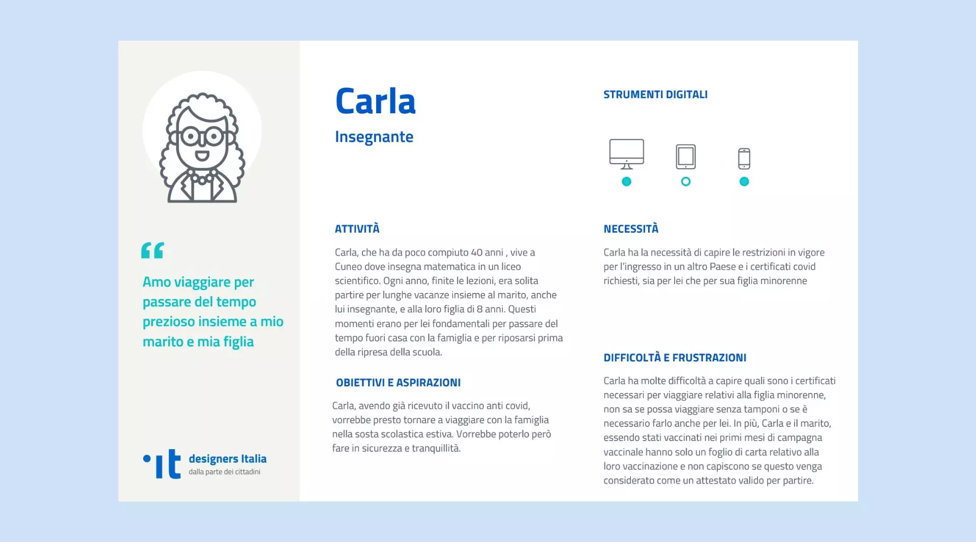
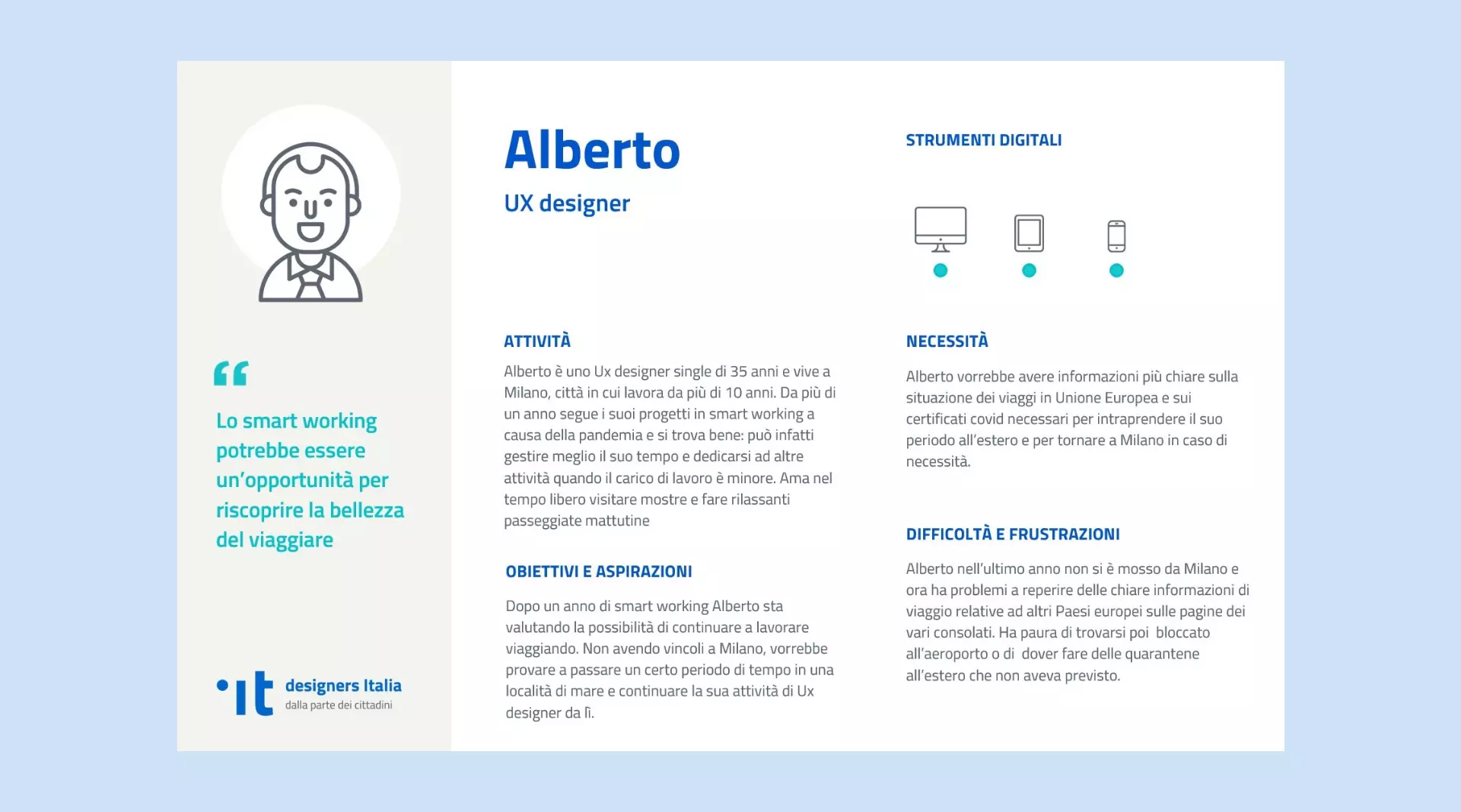
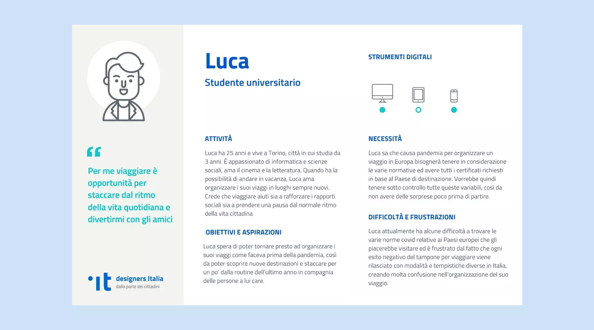
Personas


User Journeys
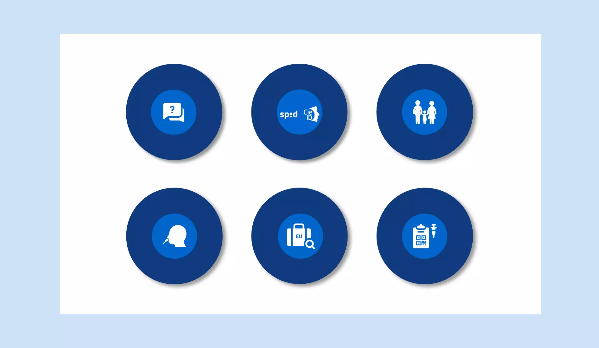
Functionality
1) A direct visualization of vaccines and results from swab
tests done in Italy, with all the useful information about
validity, expiry and outcome. Also, my solution considered a
coordination between public and private facilities for the
documents’ release inside the application by means of digital
signature and UE interoperability mechanism. It also guaranteed
the possibility to manually add into the app the certificates
obtained abroad.
2) The possibility to search for a European country to visualize
its anti-Covid rules for entry. By selecting a country, it
should have been visible if the user had the certificates in
compliance with the regulations of the country intended to
visit.
3) The possibility for parents to add the children’s
certificates into the app in order to have all the family’s
documentation in one place.
4) Some functions of support, tutorials and authentication, the
latter one by means of SPID (Public Digital Identity System) and
CIE (Electronic Identity Card), in order to keep an external
coherence with other public applications.
At this point, I focused on the visual identity and the prototyping of the application in a way that it would keep an external coherence with the other government applications, and it would integrate the previously identified functionalities.
Visual design choices
For prototyping, I started by employing the UI KIT by designers
Italia, a landmark in the design of Italian digital public
services and which is a state resource accessible in open
source. The kit consists of guidelines on colours, fonts and
components to create an accessible application for citizens.
The application’s logo, however, was designed in flat style with
geometric shapes that evoke on one hand the image of a flower,
which was the symbol of the Italian vaccination campaign, on the
other a landscape, which represents the travel beyond our homes.
In the centre of the logo, it was inserted the name of the
application in order to have it always visible, even in absence
of other text that matches the logo.
![]()
Prototyping
After some drafts, I built an high fidelity prototype in Adobe
XD. It was built with a high level of detail and interactivity
with the aim of being as close as possible to a finished product
and ensuring the possibility to be tested with real users
afterwards.
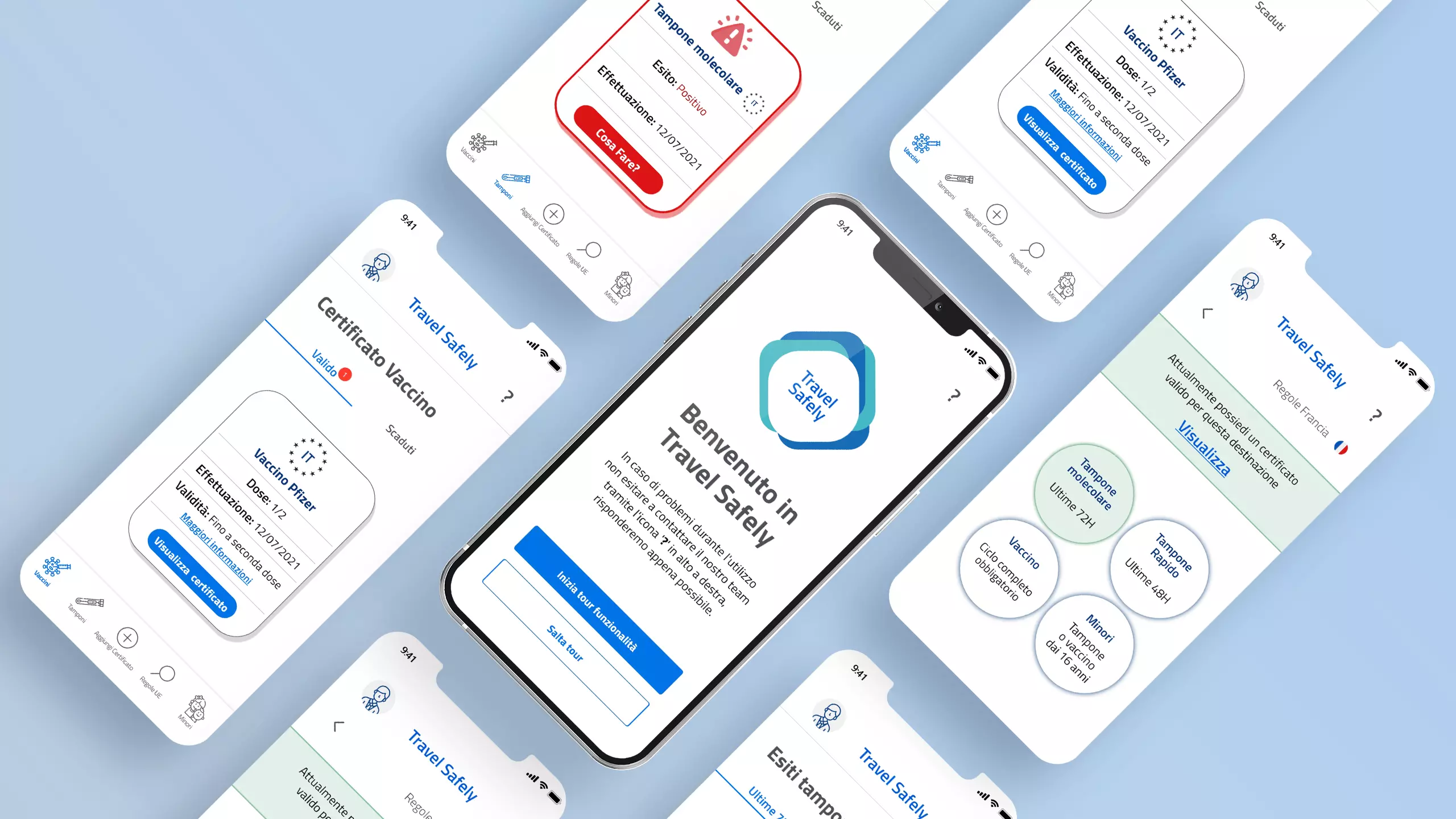
During the prototyping phase, I created 3 different flows that
represent three real scenarios.
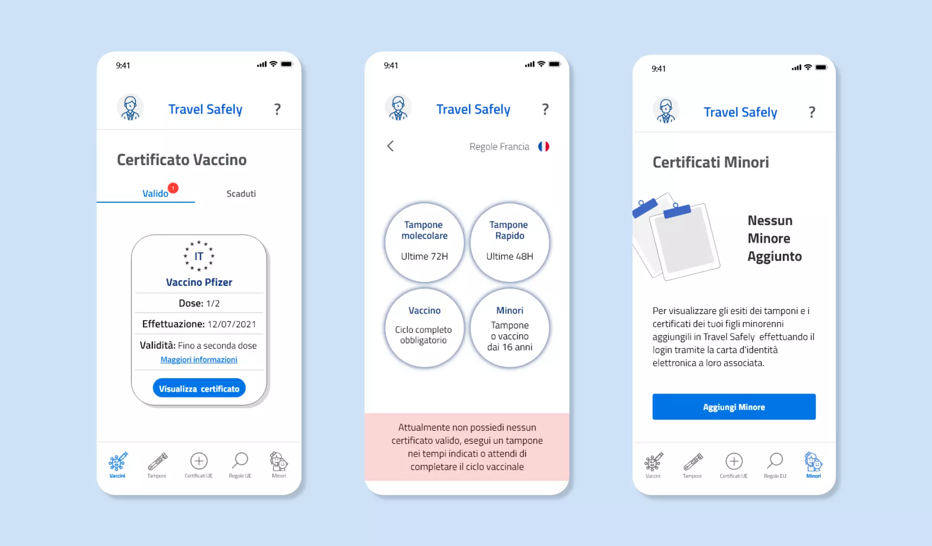
In the Vaccination scenario the user has done the Anti Covid
vaccine, it can visualize the details of it and always have the
European certificate available for travelling. The user can also
look for the rules for travelling to a specific EU country and
add the certificates of their minors inside the app.
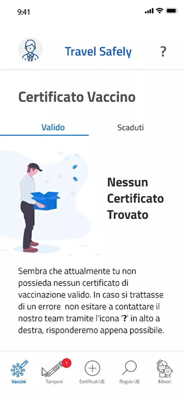
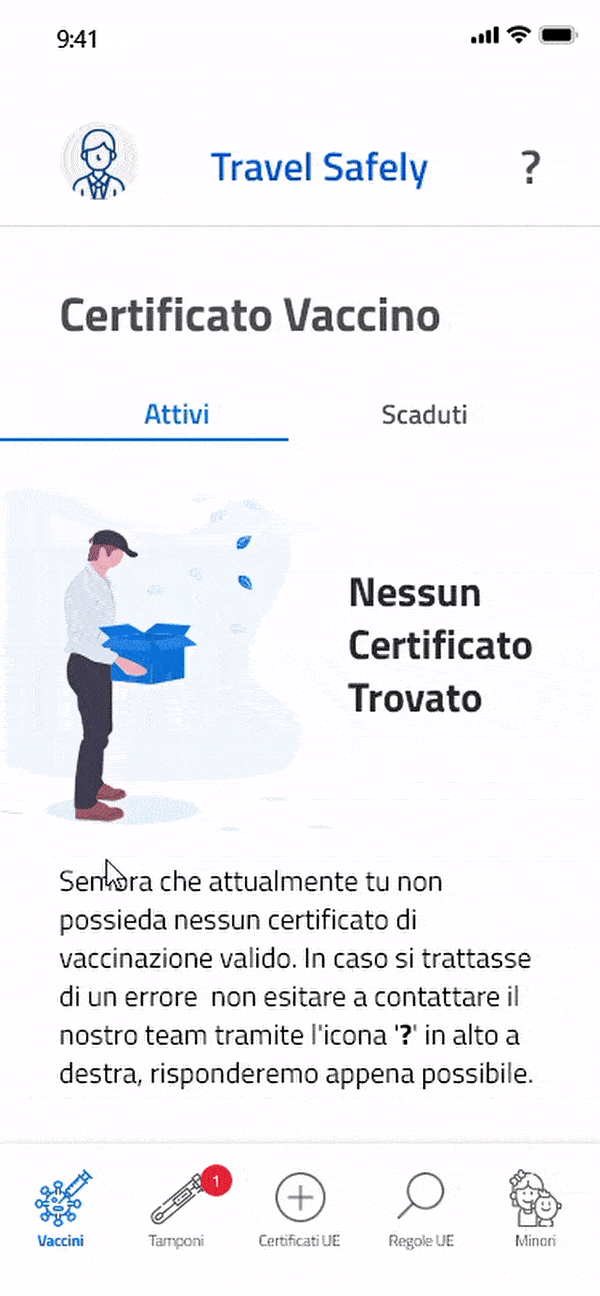
In the Negative test scenario, the user hasn’t done the vaccine
yet, so it relies on tests for travelling. In this case, the
result of the test is negative, and the app shows the details of
the test validity, the expiry date and the European certificate.
The user can also browse all the expired tests in a specific
section and visualize the travelling rules for the European
countries.
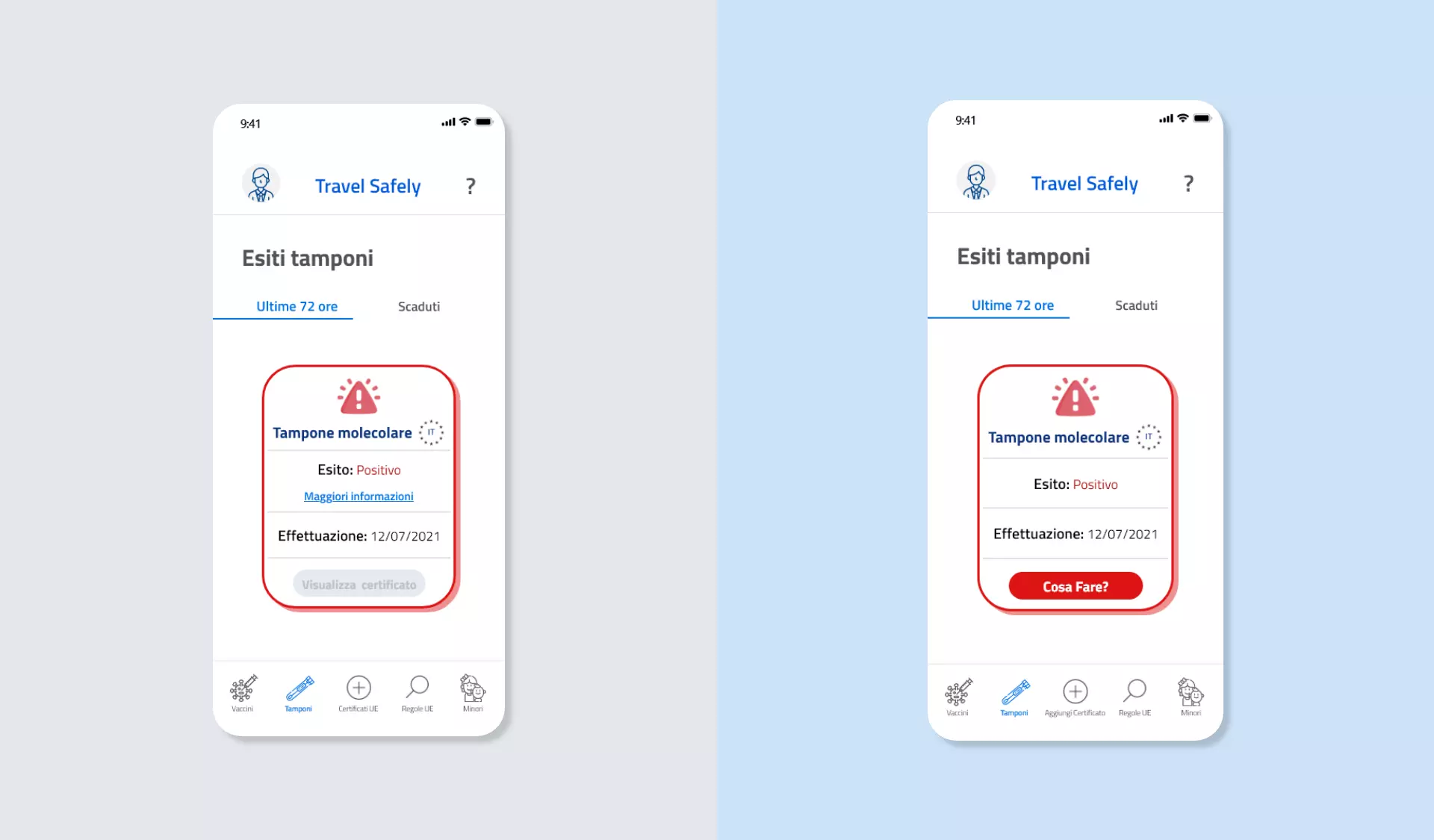
In the Positive test scenario the user hasn’t done the vaccine
yet and it relies on tests. This time, the test result is
positive, and it is shown on the screen. So, the app reports the
information on what to do next but it is not possible to
visualize any travelling certificate that is released when the
result is negative.
In the last phase of the project, the high fidelity prototype was tested on real users. It allowed to identify and redesign the most critical elements in the application.
Users recruitment
Having already defined the target users, I selected the real
users who had the outlined characteristics and needs, in such a
way to obtain a coherent evaluation with the user research
phase.
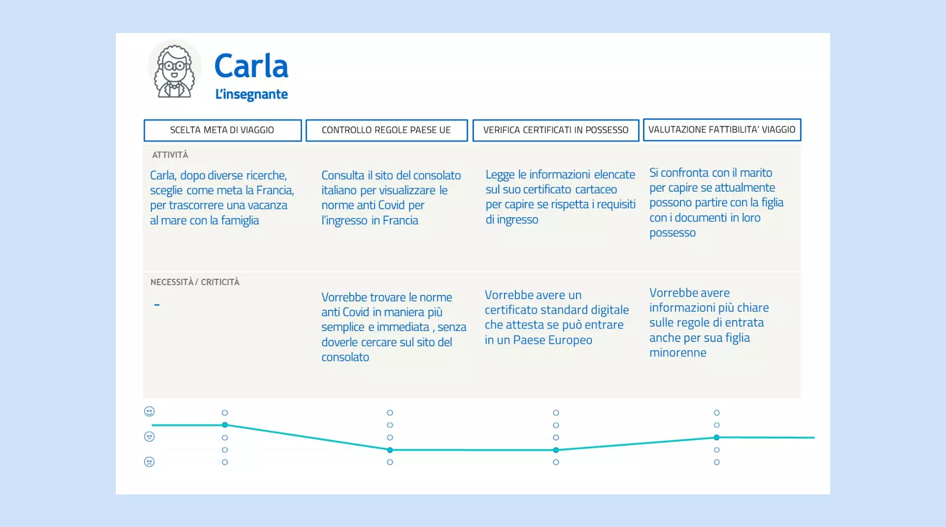
The first user was a 40 year old middle school teacher with
family, she often organizes the holidays with her husband and
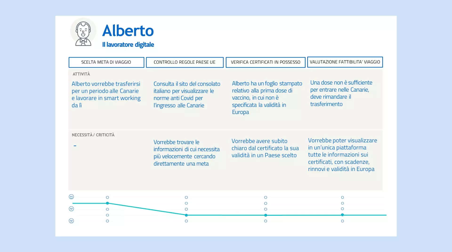
her underage daughter. The second a 30 years old freelancer, he
works in IT and he often travels abroad to work remotely. The
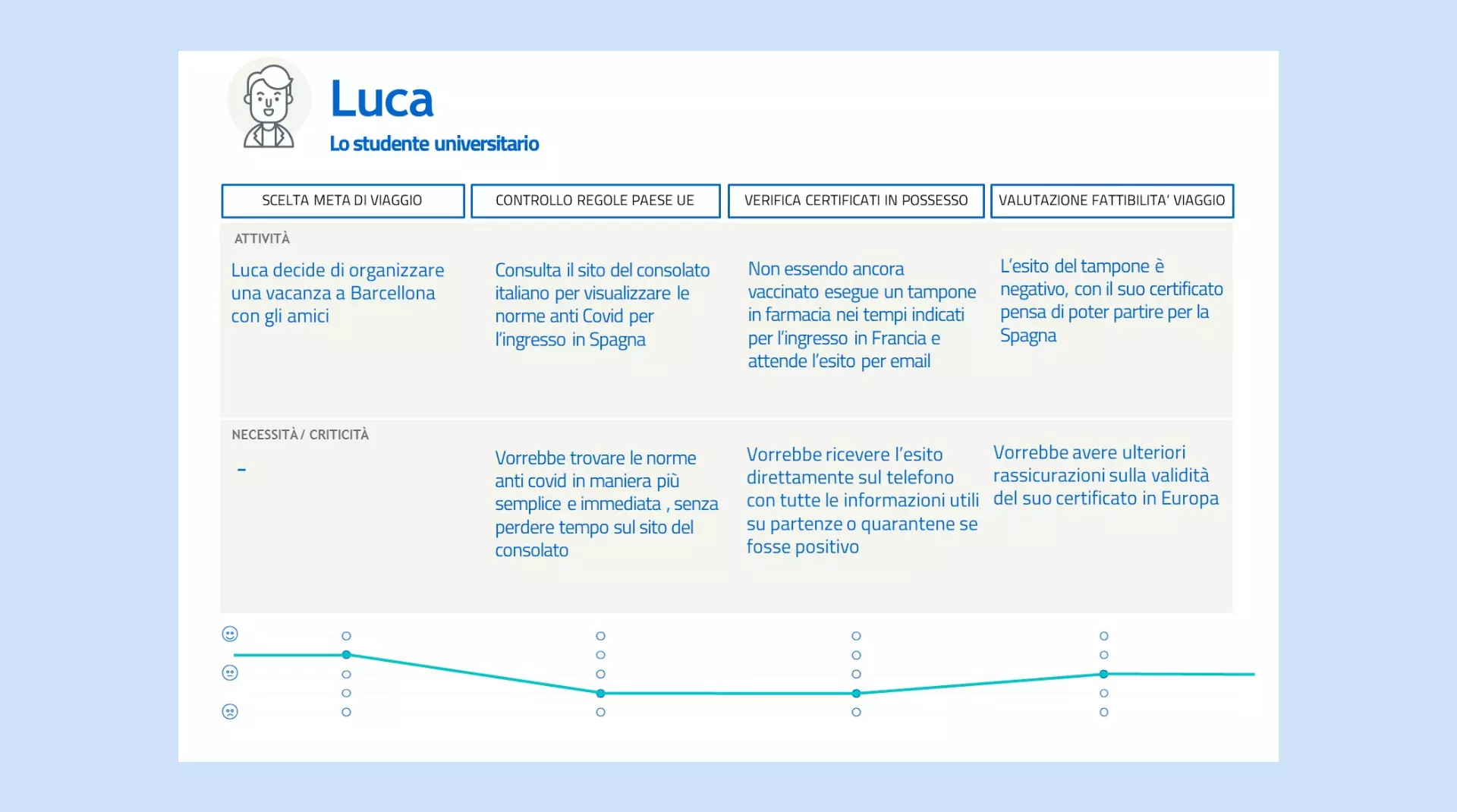
third was a 25 year old university student, she usually plans
her holiday at the end of the semester after the exams. The last
user was a 17 year old highschool student, he often plans his
holiday during the summer months with his group of friends.
Methodological aspects of the evaluation
For the evaluation of the app’s usability, I took in exam single tasks related to flows that were previously implemented to test the main functionalities of Travel Safely. In particular:
- Vaccine certificate visualization: in the first task, the user was asked to visualize his vaccine certificate and all the related information, then add it to his wallet. It was also asked to visualize the expired certificates.
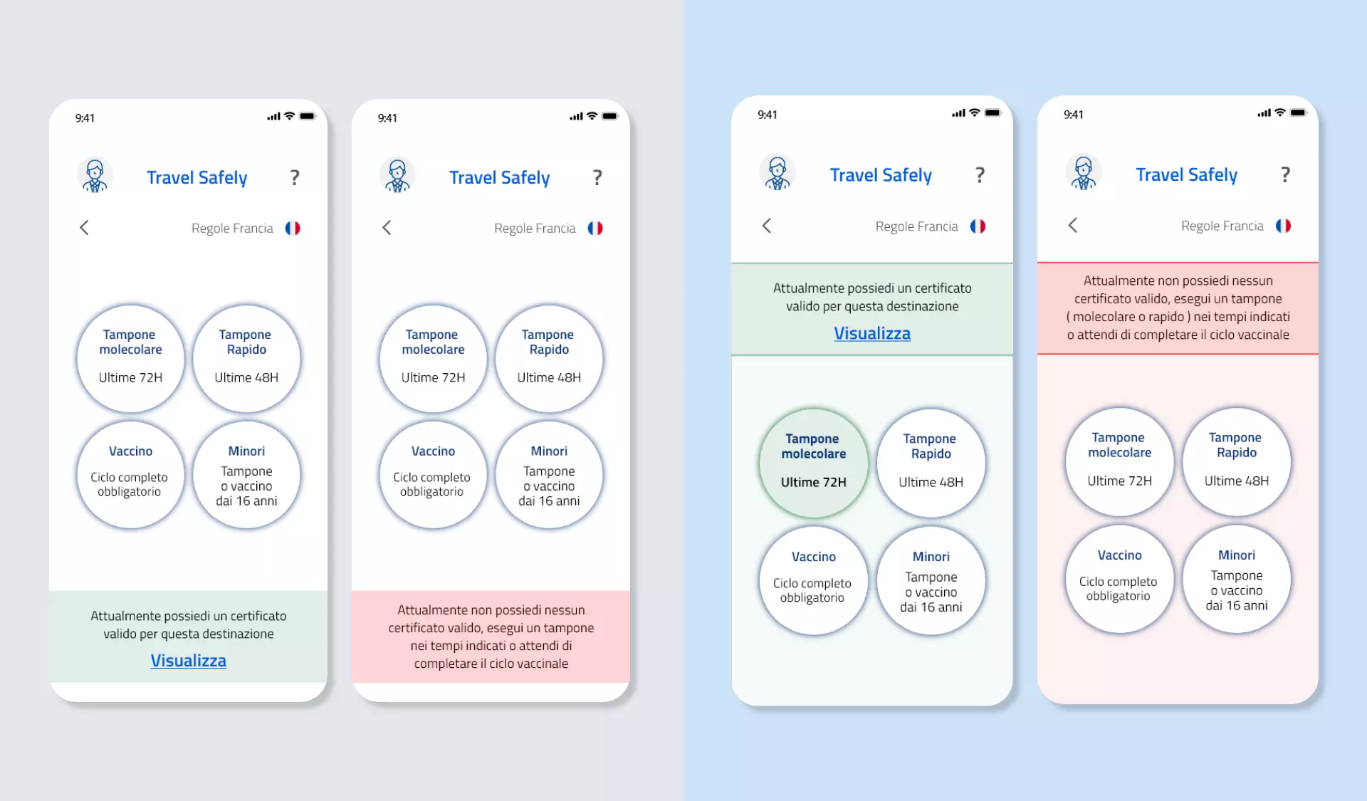
- UE travel rules visualization: in this case, the user had to look for and comprehend the rules for travelling to France and to visualize a valid Covid document to enter the country.
- Supplement of a minor’s certificate in the app: in this task, the user was asked to add two minors’ certificates in the application and to visualize their content.
- Negative test visualization: it was asked to the user to visualize his negative test in the specific section and understand the information about its validity and expiry.
- Positive test visualization: in the last task, the user was asked to visualize his positive test and understand the guidelines on what to do next to address this situation
The interactive prototype was tested in presence with all the
users with an Iphone X that was arranged specifically for the
simulation. I personally guided the testing as the moderator,
and two colleagues acted as observers who noted down all the
users’ errors, opinions and doubts.
It was provided all the information such as the length of the
test, the goal of the evaluation and the task to carry out. For
the purposes of a correct evaluation, the users were told that
they could not be helped in solving the task.
Moreover, it was asked them to think out loud (thinking aloud
procedure) to ease data collection. It was attempted to put the
users at ease by ensuring them that what were tested were not
their digital skills but the usability of the application with
the aim to improve it for other users.
Relevant errors
From a qualitative point of view, the users reported that they found the app pleasant, easy and useful. Though the task analysis revealed four main errors that were made by several users, in particular in order of frequency:
- UE travel rules visualization: 4/4 users didn’t notice the banner at the bottom of the specific page that indicated whether they had the documentation required to entry the country. Their main focus was in the upper part of the page.
- Positive test visualization: 3/4 users didn’t notice the “further information” link that would have opened another page that summarized all the guidelines on what to do in case of a positive test result, since they didn’t associate that link with the most important information.
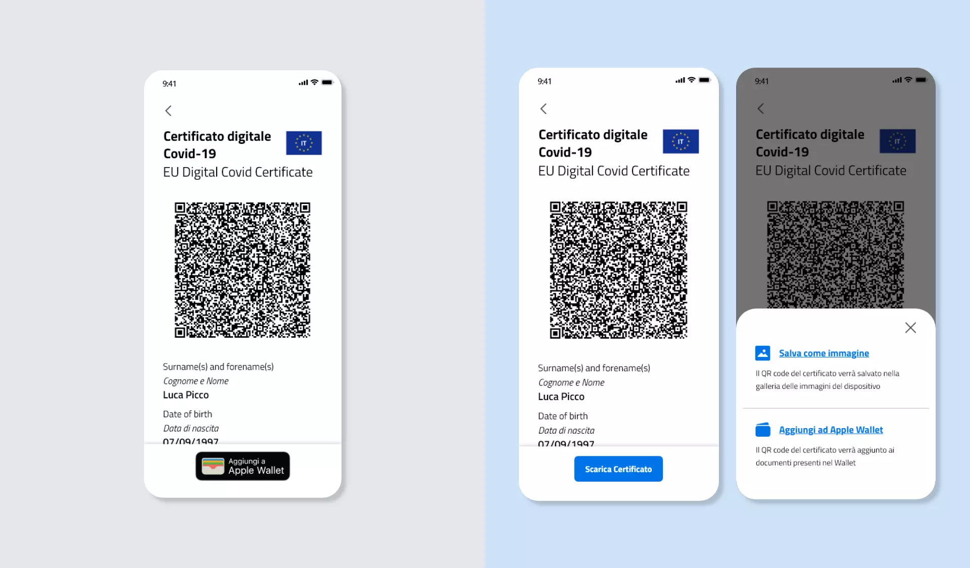
- Vaccine certificate visualization: 2/4 users looked for something that would have enabled them to download the certificate as in image in their camera roll instead of saving it in the Wallet.
- Negative test visualization: 2/4 users looked for the time of the test in addition to the date since its validity is limited.
Redesign
In the last part of the first cycle of the User Centered Design,
I corrected the interface looking for some solutions to the most
common interaction problems previously identified.
The first correction was on the information page about the rules
of entry for European countries. The banner was made more
graphically visible and it was positioned in the upper part of
the screen, so that it won’t become less important in the
information hierarchy as it previously used to happen to several
users.
Moreover, the whole page was chromatically enhanced
in order to highlight the user’s situation in case of entry to a
European country.
Then I focused on the visualization of a positive test, which
caused some issues to the users since it wasn’t clear enough how
to deal with the situation and who to contact.
On
this screen, it was made more graphically visible, the text was
made clearer and more hierarchically important the section to
access the relative information, that now replaces the button
for the certificate visualization, which didn’t have any real
use in this specific contest.
The third correction was made to allow to offline download the
anti Covid certificate. Initially, only the Wallet was
considered as an option to store it, but this caused some
misunderstandings to whom the technology was not familiar or to
whom expected to store it in its photo gallery.
So, it was developed a button to save it that allows to store it
in both ways giving brief information on the methods. In this
way, a more autonomous way to offline download the certificate
is guaranteed.
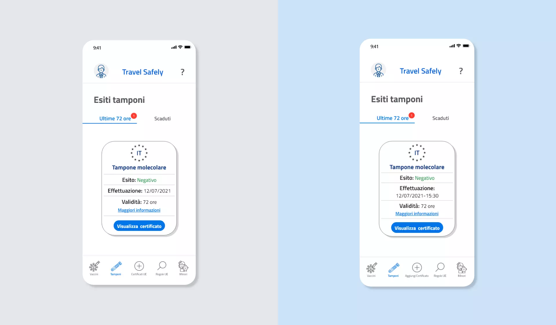
The last correction revolved around the summary card of the
negative test certificate. In this case, it was added the time
of the testing, not only the date, to ease the organization of
the travel.