The aim of the project was to design and build a website describing one initiative among the 17 goals of the 2030 Agenda for Sustainable Development.
Introduction
The realization of the project started after our teachers gave
us the brief. Our aim was to design and develop a website with a
human-centered approach in a simulated context where time and
resources were limited.
The main theme of the site was relative to the online
communication of an hypothetical project that had to meet one of
the goals from 2030 Agenda.
Project Output
Starting from these premises, it was born ReUse.
We created the visual identity and a showcase website for an
application which would allow users to donate and receive
second-hand items between privates and to give away unsold
products from companies. This would favour the reuse of items
and the fight against waste.
This project meets goal 12 from the 2030 Agenda that is to
ensure sustainable consumption and production patterns, in
particular covering the aspects of a substantial reduction in
waste generation by means of prevention, recycling and reuse.
Once defined the idea, we looked for possible existing realities in Italy in this field to identify some opportunities in the design process.
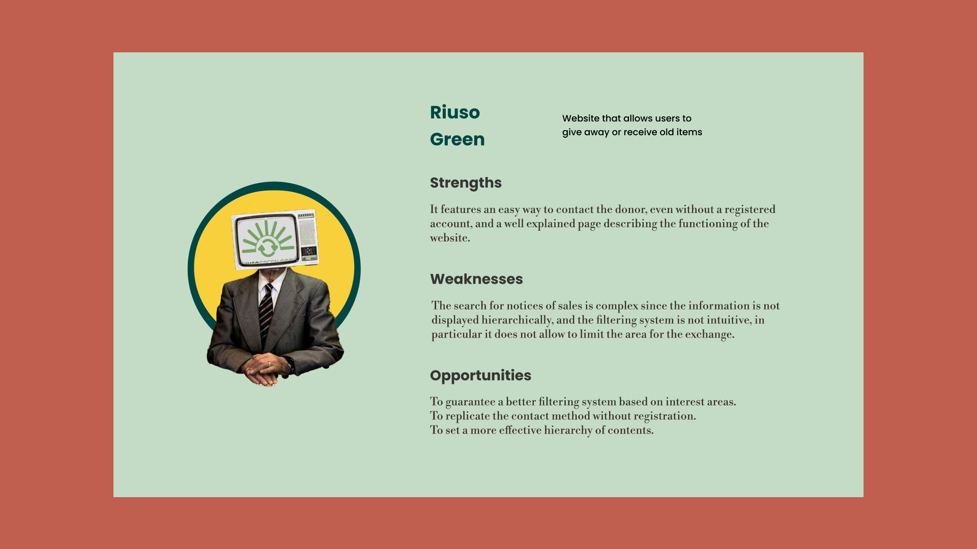
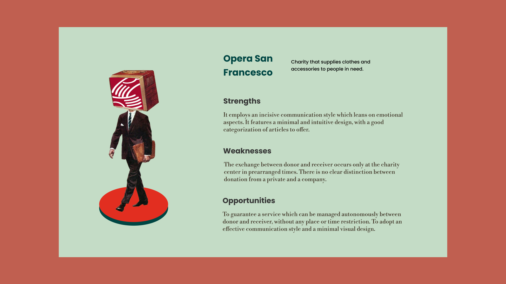
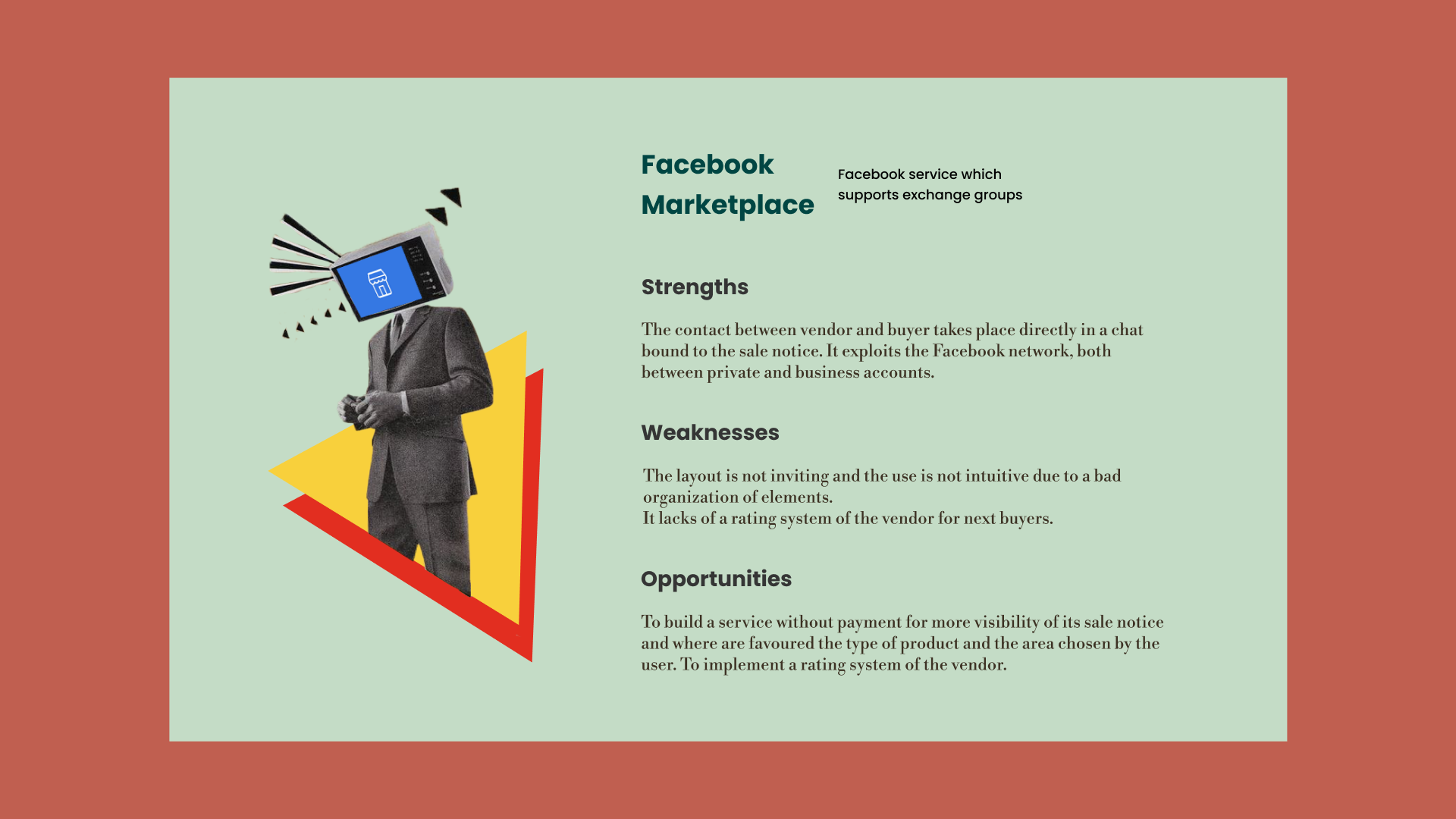
Competitor analysis
In this phase, we carried out a general benchamrking by analysing three entities which already brought something similar to our idea. From this analysis, we summarised for each competitor its strengths, weaknesses and opportunities for our project.


In the next phase, we restricted the targets of our application to outline what kind of user we had to reach with our idea.
Some data
In order to identify our target users, we examined the study
"Gli italiani e lo sviluppo sostenibile" carried out by Green
media lab and Norstat, which underlines the different
interconnections (environmental, social and economic) crossing
the sustainable development in Italy.
In this research study, several aspects of Italians were
considered, from value orientation to sustainability to
environmental attitudes adopted by the surveyed users.
In the study, the majority of the surveyed (80,4%) affirmed that
the concept of sustainability was clear. Even a larger group
(89,2%) declared being sensitive to this topic and believed that
the main contributions to a sustainable development are
environmental (95%), social (93,2%) and economic ones (89,4%).
Younger surveyed were more sensitive towards environmental
issues, whereas female surveyed and people with a higher degree
of education were more sensitive to social issues. Economic
issues were the main concern of the male surveyed and people
more vulnerable on the job market, both in terms of age (young
people under 35 and people between 56-65 years of age) and in
terms of education (mostly people with low-middle level of
education).
A third of the surveyed (31,9%) stated that they knew what is
the 2030 Agenda; among those, almost 70% (so the 23% of the
total surveyed) demonstrated a real understanding of the Agenda
and nearly half of them (so the 16,6% from the total) identified
the United Nations as the promoter of the initiative. Again,
both generation Z and higher level educated surveyed showed to
aknowledge not only the Agenda, but also its goals.
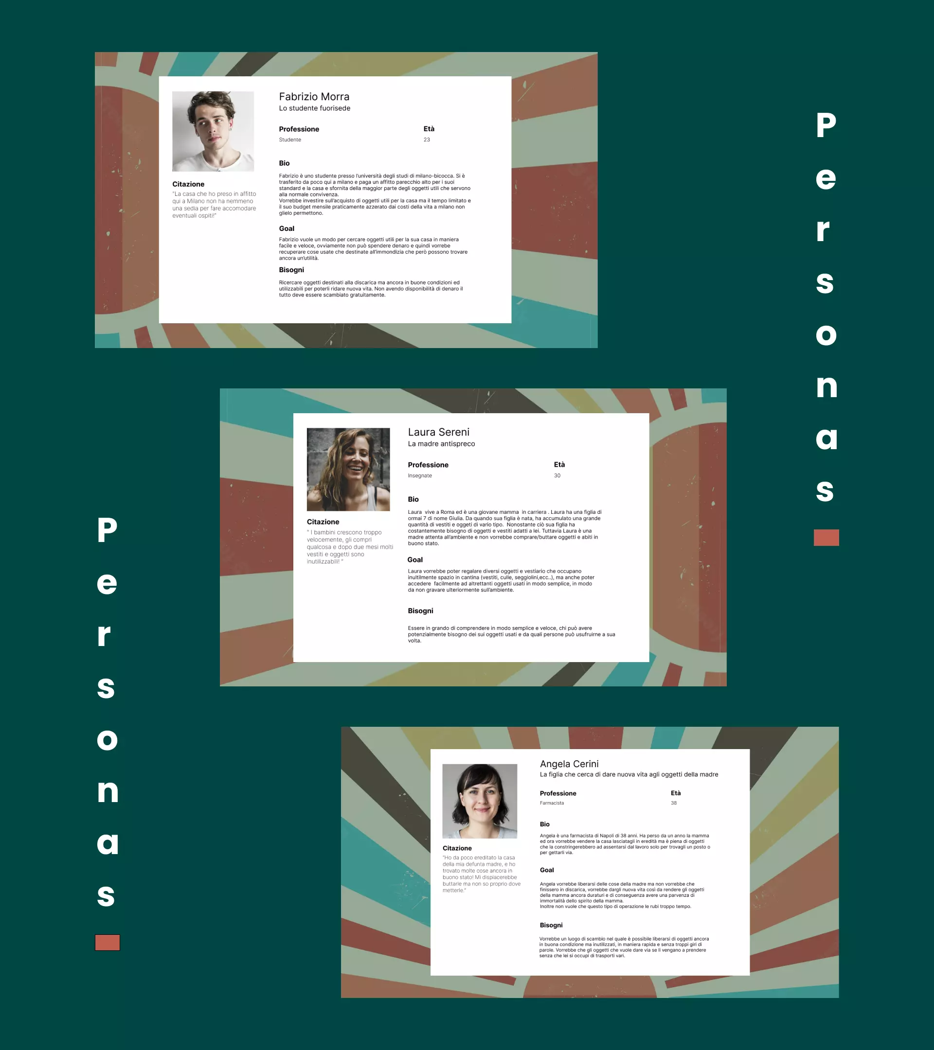
Proto Personas
Since we didn't have enough time to carry out our interviews and surveys, we created some proto personas based only on our experience and our hypothesis, supported by the data previously analysed. In this way, we defined our ideal users for whom we, as a team, would design our website.
From here, we designed the concept and the visual identity of ReUse, putting together the first pieces useful for building our presentation site of the project.
Concept
The main idea around which we developed our work was to give new
life to old things, to add color to forgotten or unused items.
So, the visual identity was an attempt to juxtapose the vintage
world with the bright colors of modernity.
This refers to a broader idea about contemporary circular
economy, dictated by the principles of environmental
sustainability, reuse and willingness to gift.
Moodboard
Once defined the concept, we visually represented the idea,
trying to create a map of inspiration to clarify the aspects to
follow in the next phases of the project to the whole team.
After research and refinement, we reached a moodboard, a color
palette and some initial idea of the fonts.
This map was the starting point for the building of a system
design and the graphical components of the site.

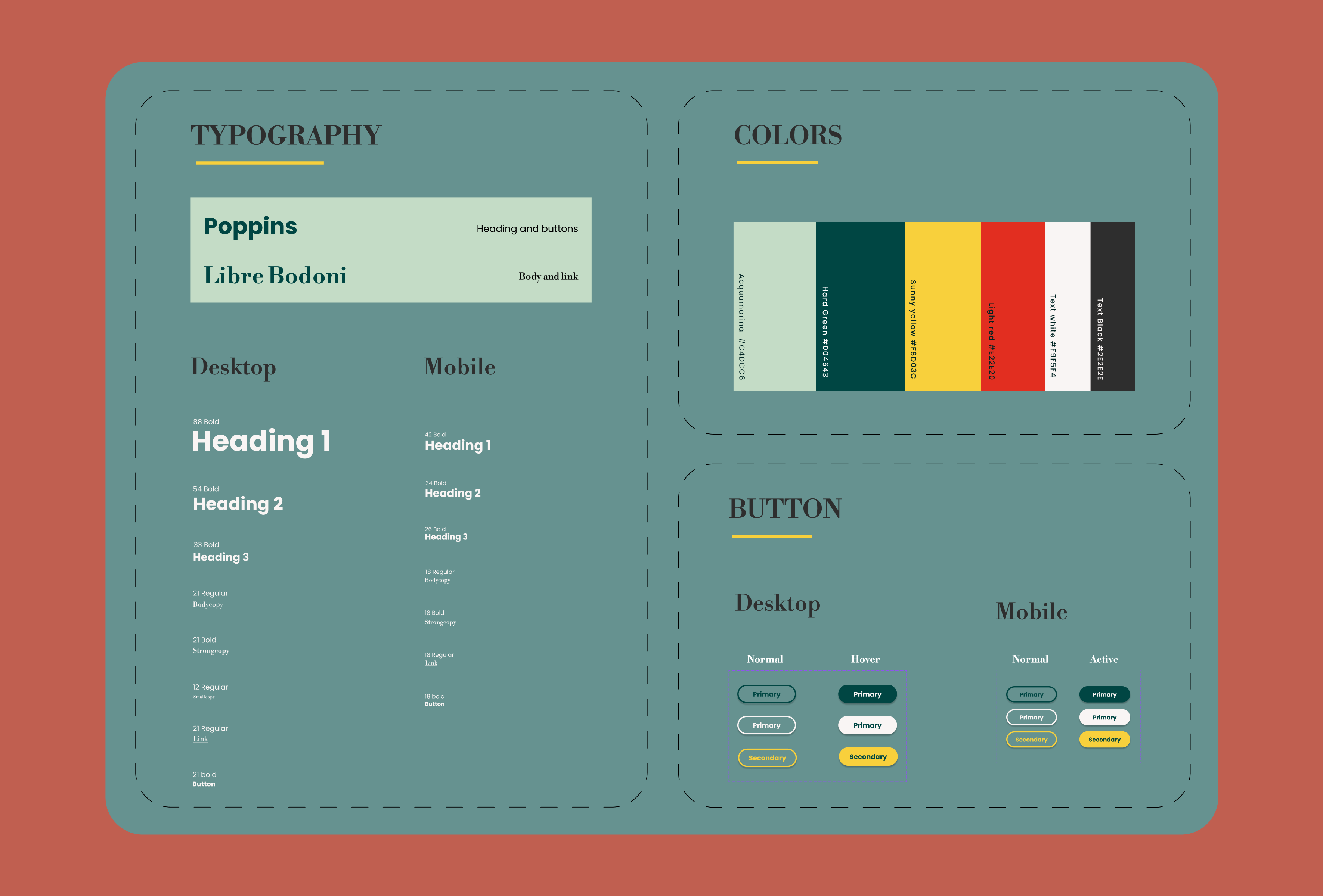
Design System
Since we needed a coherent website, from the beginning we
planned an essential design system consisting of a typrographic
hierarchy, color palette and main buttons for mobile devices and
desktops.
Afterwards, it was enriched of other graphical recurrent
components, as we progressed in building the visual structure of
the website.
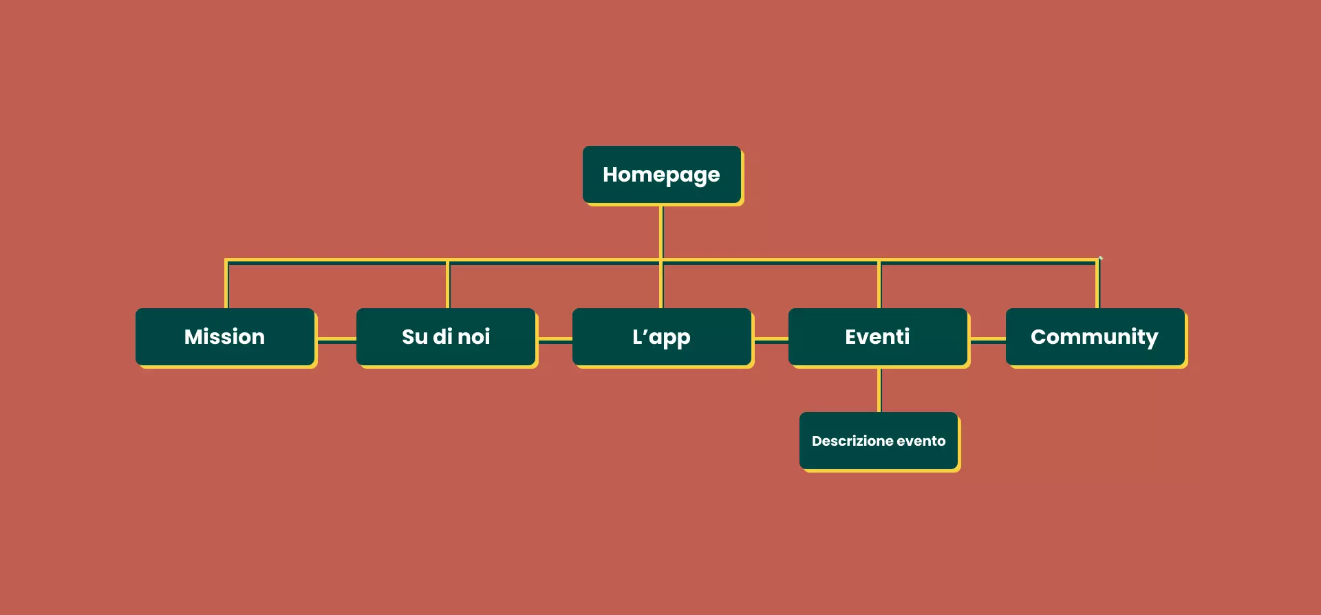
We outlined the main aspects that were necessary to communicate our product in order to sketch an information architecture of the website.
Sitemap
We focused on the structure of the website, defining the number of pages that we had to create and the function of each of them in our project:
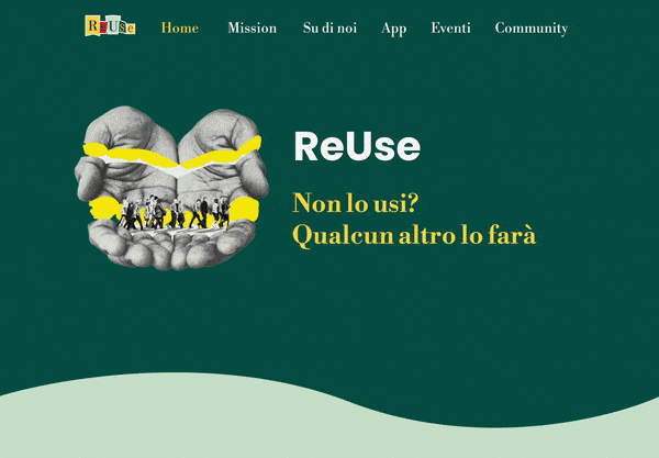
- Home page. It's the main page of the site, it summarises our mission and explains the purpose of our application. It features some calls to action that return to some details in other pages of our site.
- Mission. Our mission responds to the 12th goal of 2030 Agenda for Sustainable Development. This page informs the users of the theme regarding the application.
- About us. Description of our team, motivations behind the realization of the site and brief introduction to companies that share the vision of the project.
- App. Description and images of the application with information for privates and companies.
- Events. Page displaying the events associated to the project and to the world of circular economy in Italy.
- Community. Page dedicated to our community, in which it is possible to get information about groups associated to environmental sustainability and reuse of second-hand items.
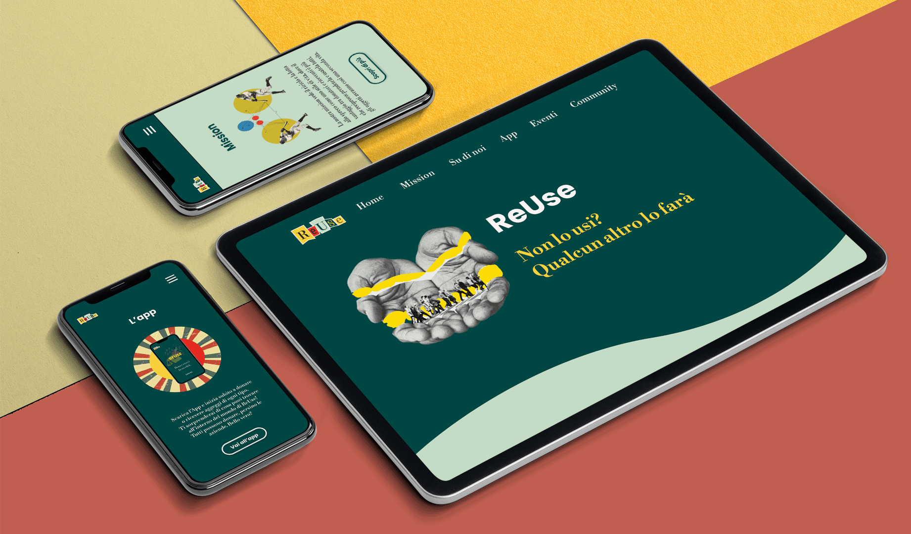
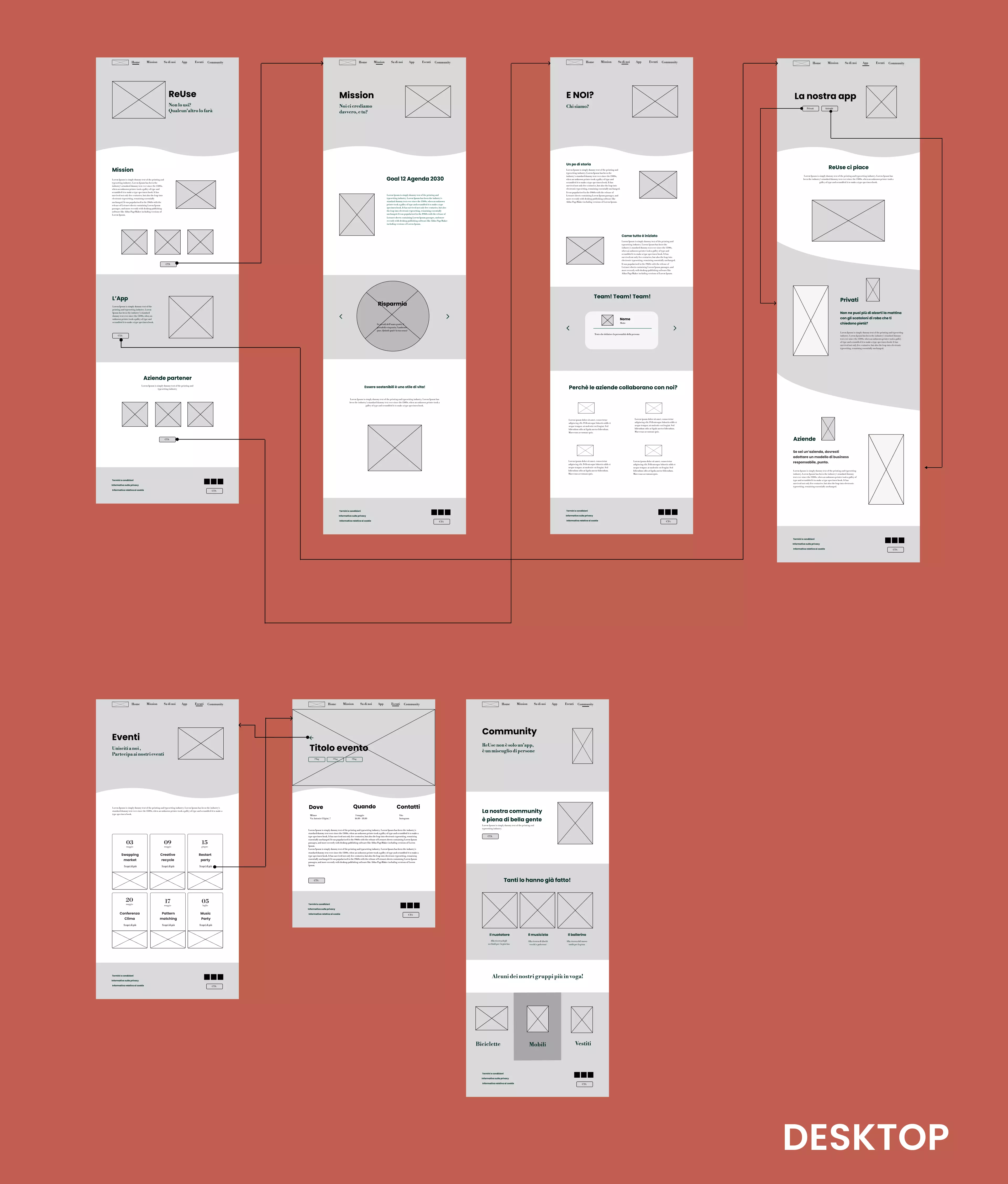
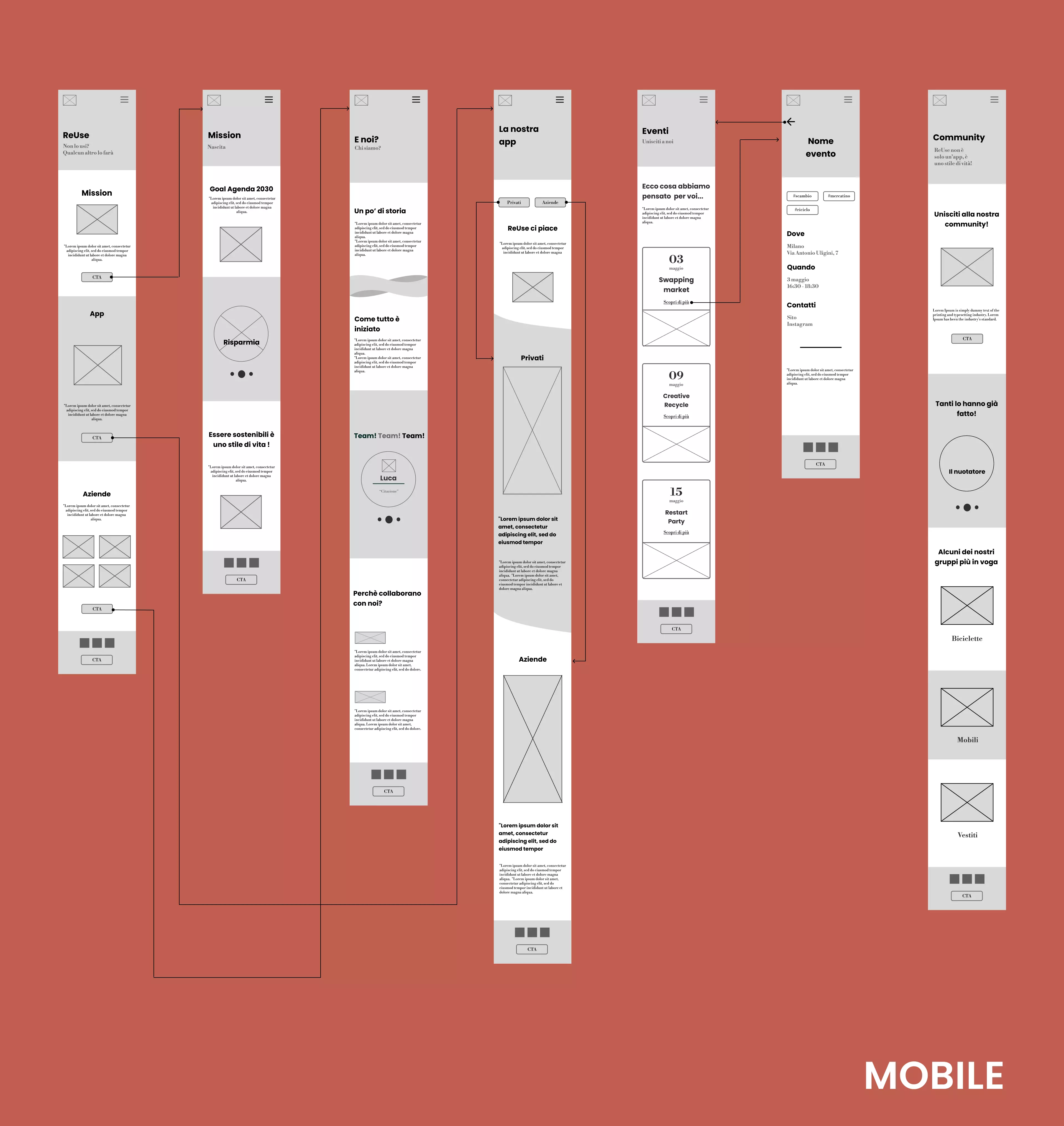
In the last phase, we prototyped the site, starting from the construction of wireframes to a final high fidelity prototype.
Wireflows
Through the construction of wireframes, we connected the
conceptual structure of the site to its first visual
representation, both for mobile and desktop version.
Then, by means of wireflows, we mapped the elements that the
users visualized on each screen and the possible actions on
them.
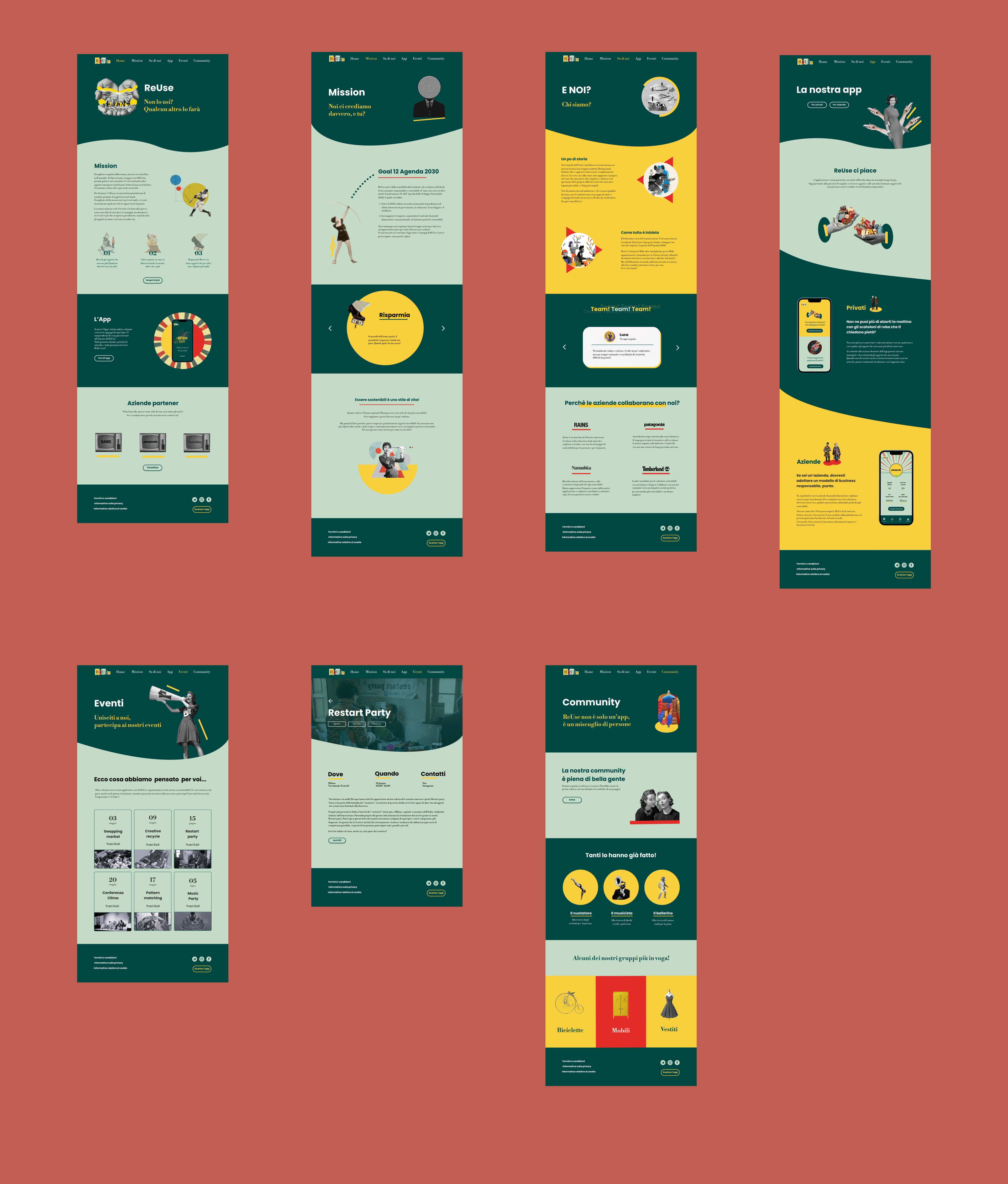
High fedelity prototype
After having clearly defined the conceptual organization of the
content, we focused on the graphic design of the website by
means of high fidelity prototypes, both for mobile and desktop
versions.
In this phase, we referred to the visual style and to the design
system previously defined in a way that we could obtain a
coherent work with our tone of voice.