The project aimed to create a digital platform that could grow with the company, integrate new products, and clearly showcase Satispay’s offerings while emphasizing the service’s ease of use.
Introduction
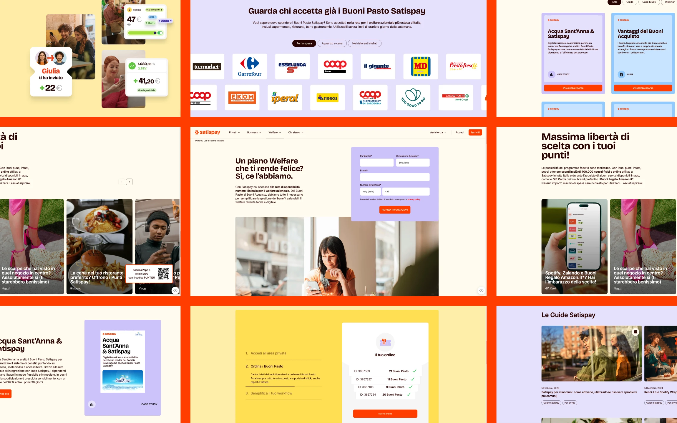
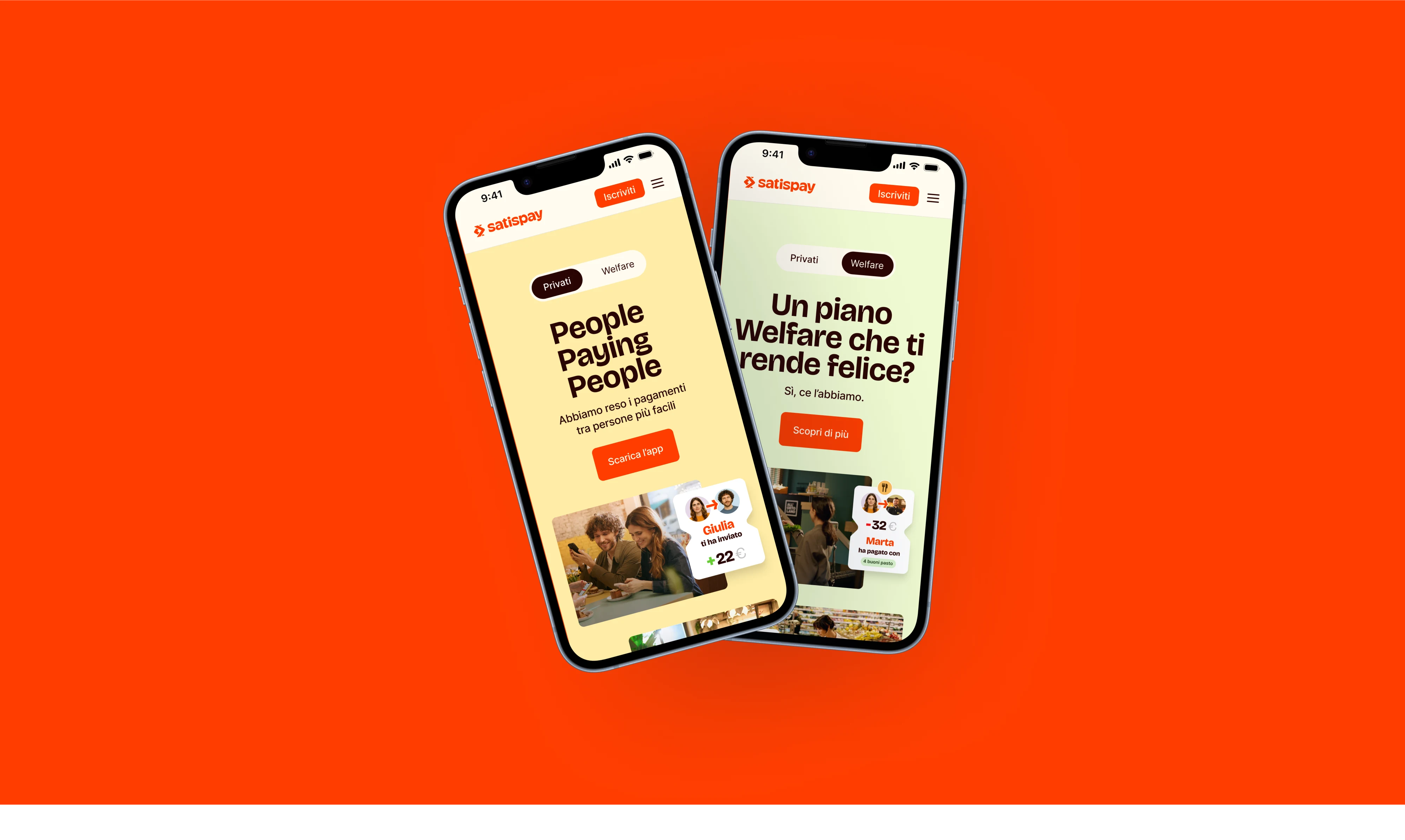
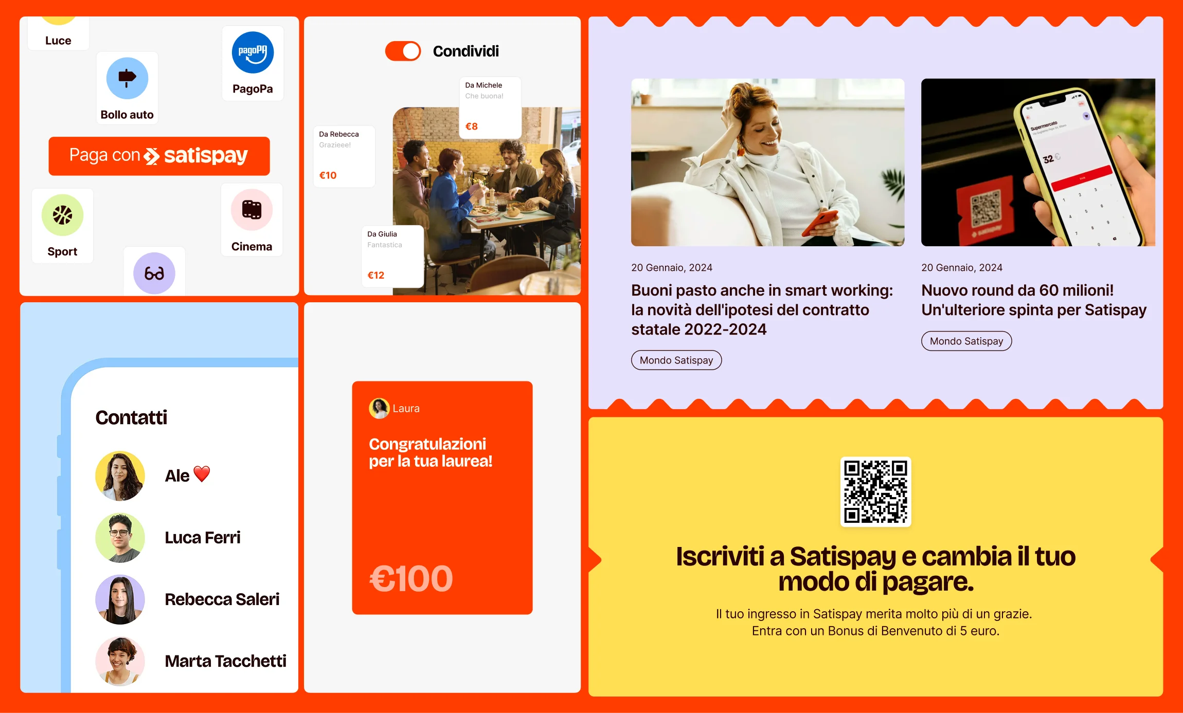
The concept behind the project was to design a digital
experience that clearly communicates the full range of
Satispay’s services and features. The website combined
informative content with practical tools, guiding three distinct
audiences through tailored journeys.
Within this framework, the redesign focused on creating a
modular, scalable platform able to evolve dynamically with the
company.
Project Output
In just 13 weeks, we built the core of the website, over thirty
pages covering private, business, and welfare services. The new
experience guides the three main audiences directly to their
goals, encouraging them to take specific actions.
Thanks to this redesign, organic traffic increased tenfold,
confirming the positive impact of a user-centered strategic
approach.
From the very beginning, it was clear that a structured system was missing, one that could ensure consistency, speed, and scalability. We needed to design a solid foundation that would allow the website to evolve at the same pace as the company, without losing its identity.
My role
Based on these premises, my initial focus was the creation of
the new website’s UI Kit. This served as a design anchor for the
team, providing visual consistency, reducing creative
redundancy, and speeding up design and development with
ready-to-use components.
Once this base was consolidated, I shifted my focus to designing
new pages and features, working in constant dialogue with
stakeholders to support a website in continuous evolution.
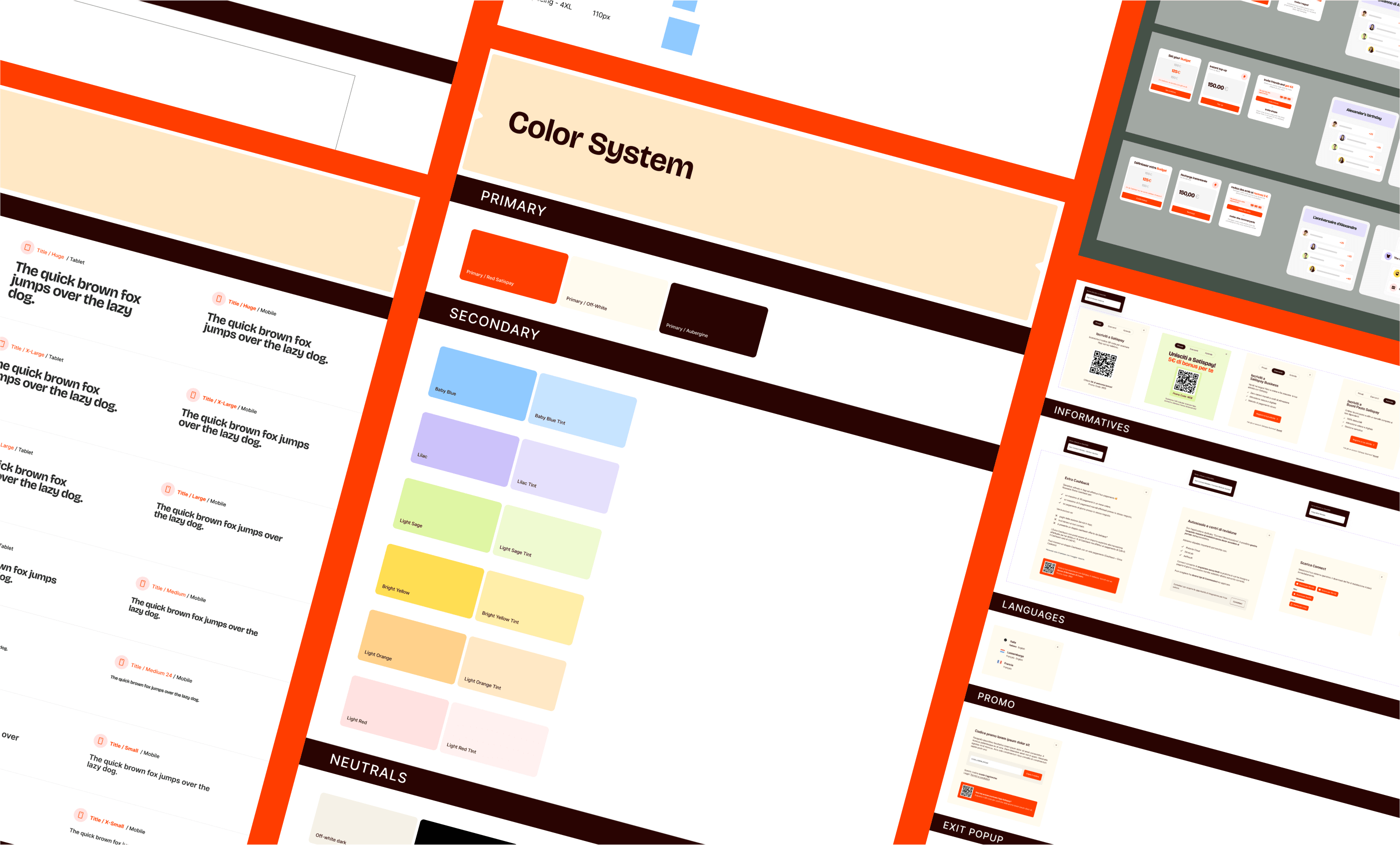
The UI Kit, created in the early stages of the project as a design guide, became the foundation for the entire product design system and now includes hundreds of components, visual assets, styles and variables.
Building the Kit
Developing Satispay’s UI Kit was a central and critical phase of
the project.
The goal was to create a system that could support a dynamic
website, ensuring visual and functional consistency across pages
without slowing down design and development. The process started
with a thorough analysis of the new architecture, recurring
patterns and user needs, identifying which structures could
become part of a modular system. Typography, color palette,
atomic components and complex layouts were defined in parallel,
creating a shared design language.
A key challenge was balancing flexibility with consistency:
components needed to adapt to new sections and future features
while maintaining uniform aesthetics and behavior. I used an
iterative approach, designing and refining each complex
component alongside designers, UX writers, and developers,
incorporating continuous feedback and real use cases.
The outcome is a comprehensive system, now including hundreds of
components, visual assets, and variables, which guides the
team’s daily work. It has sped up design and development while
helping maintain a high standard of user experience.
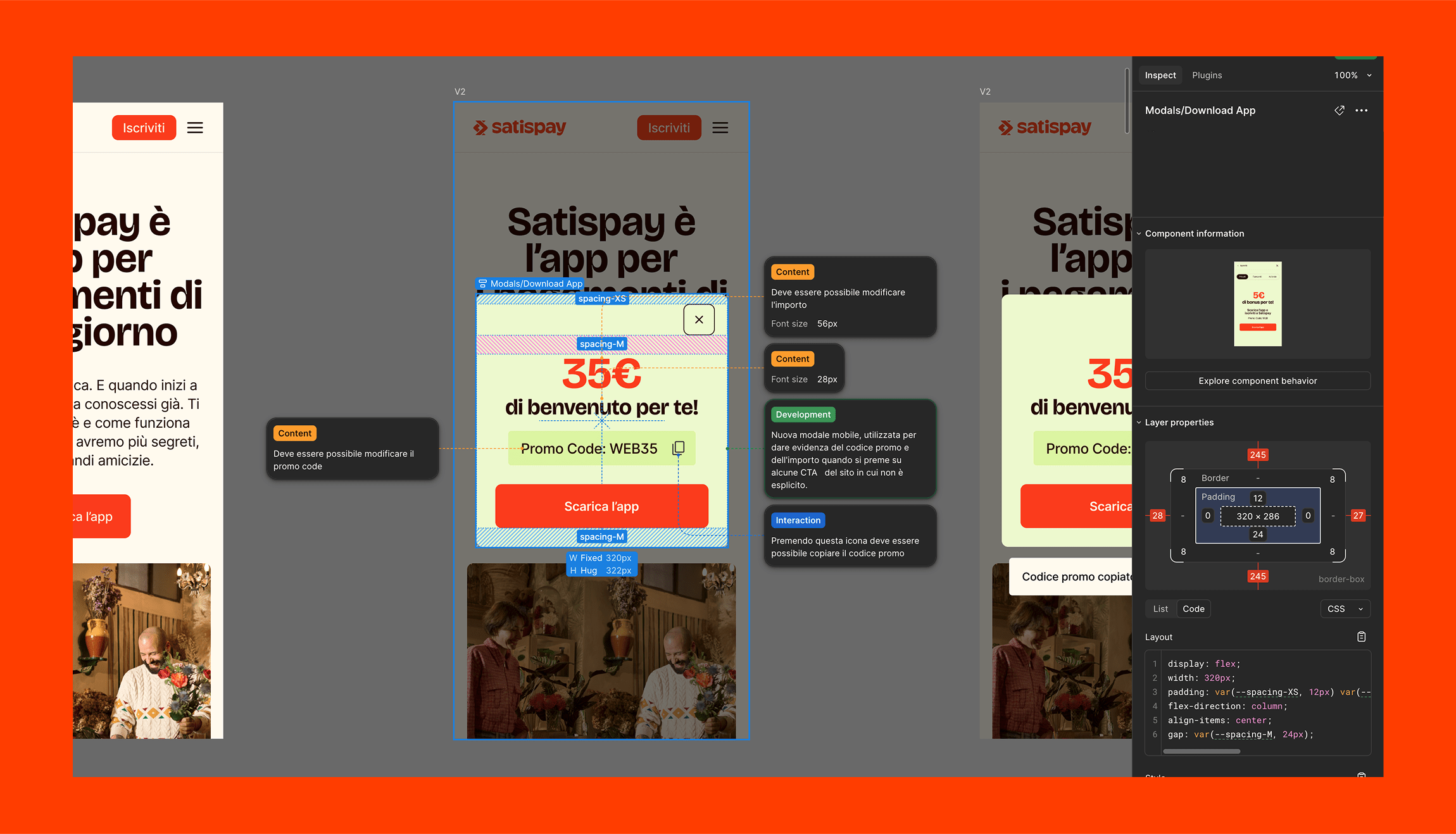
The UI Kit as a Bridge Between Design and Development
In this project, I managed the UI Kit not only as a tool for
visual consistency but also as a direct communication channel
with the development team.
I prepared all components to be fully inspectable in Figma’s Dev
Mode, making properties and technical specifications immediately
accessible. I also added detailed annotations on key aspects,
such as interactive behaviors and usage rules, to facilitate
developers’ work and avoid ambiguities. A crucial element was
defining a consistent component naming system, designed to be
easily replicated in the development environment.
This approach ensured clearer handoffs, strengthened
collaboration, and sped up the implementation of components
throughout the project’s evolution.
With a solid structure in place, in the next phase of the project I contributed to building new pages and features, following the ongoing evolution of Satispay.
New Challenges
In the final phase of the project, I was directly involved in
designing and implementing new pages and features. Once the
design foundation was consolidated, I focused on evolving the
platform, aligning the website’s growth with the expansion of
Satispay’s services.
During this phase, my work was primarily design-oriented:
optimizing navigation flows, structuring new sections, and
defining reusable patterns.
Each new implementation followed an iterative and measurable
approach, from needs analysis to validation through performance
metrics. In particular, we focused on concrete goals such as
increasing conversion rates on calls to action, reducing
drop-offs in critical flow stages, and improving completion
times for the most frequent user operations.